Tool Test: Airtable

Airtable Logo

Let’s talk tables. Tables for everything! Tables

Let us talk tables. Tables are for everything! Tables are for projects! Tables are for birthdays! Tables are for eating on! No. No. All jokes aside, tables are amazing tools that, if used the right way, can maximize efforts and can maximize productivity.
My professor at St. Mary’s University, Dr. Lindsey Wieck, introduced me to this innovative application, and I have been using it ever since.

“Airtable” has a way of helping teams track and manage projects. That is how I use it, of course.

When I approached the idea of using “Airtable” as a tool for project management, I was not thinking of historical advantages. I was not thinking of how I could access this fantastic tool in the future. My thought process around using “Airtable” was simple. The application was cute, free, and it worked. Using apps like Google Docs, Slack, and Skype, verified for me that collaborative apps were probably the way to go. This assumption has proven itself and paid off in dividends.

Now to the use of the app itself. “Airtable” is excellent. The version of the application that I will refer to here is the free version that has some restrictions, but I will lay those out here. The paid version of this tool grants users the rights to “blocks” that allow users the capability to change text colors, send text messages, integrate with other applications, etc. There are a few different options that the paid version unlocks, but those pieces were not really deciding factors in using the web-based client, so I haven’t included them here for that reason.

Using Airtable as a simple archive-tracker can do wonders. While I was tracking submissions for requests for photography, I was also storing photos from each photo shoot that could help me create a timeline in the future.

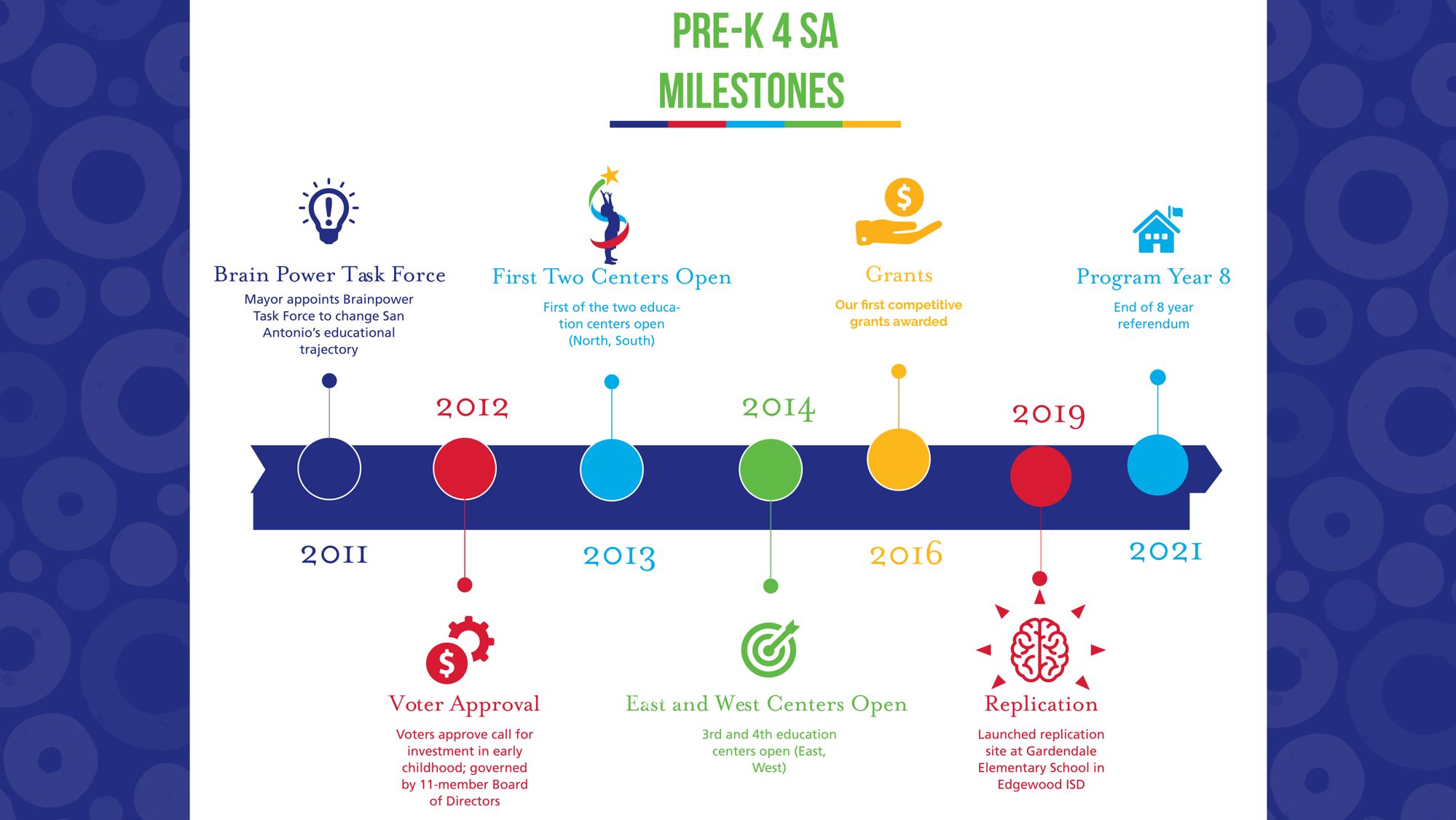
I have had the great opportunity of being invited to events and cultural happenings in San Antonio and will continue to be. These events provide me with insight and opportunity. These events also provide me with photos of a ton of fascinating subjects that represent a culture that is seen throughout the historic, 300-year-old city in Texas. The application has helped me track these events, the photos, and the contacts that I have made throughout this journey thus far.

The development of the program has and will continue to develop my workflow and can do the same for any user that is new to the system. This system also has ways to help track historical events and photos and will continue to do so for other users.

Tool Test: Adobe Indesign

Pre-K 4 SA Milestones

The cool thing about being a graphic designer for the beautiful City of San Antonio is that learning new things is a daily adventure. I work for Pre-K 4 SA, a corporation that began by through the ideas of some smart individuals that understood that early childhood education was the way to ensure a change in the infrastructure and workforce of San Antonio. Sure enough, those brainiacs were right.

I have the distinct pleasure to work under the Chief Executive Officer, Dr. Sarah Baray in a capacity that allows me to take the knowledge I have learned and use technology to convey a story or a message that is easy to understand but simple enough to engage a general audience.

Tools. Being a graphic designer does not always guarantee specific software. Being a graphic designer doesn’t always guarantee creative freedom. Being a graphic designer, in my case, did somewhat guarantee what I was going to be given to facilitate better the work that I was doing.

That said, Adobe Illustrator was a must in the world of graphic design work and let me tell you, Adobe Illustrator has become my best friend. To help an audience visualize history is no simple feat. If working with an organization, then ensuring that creations match a standard of branding can be difficult.

I started with a pallet of colors. A shade of red, a shade of blue, yellow, green, and another blue filled the color palette of my Adobe Illustrator window. Then I looked at backgrounds and fills and fortunately enough, we have a handful of those (relatively the same, but with different colors). I also started with a size. This particular project was to be made to fit on a powerpoint slide.

After determining the graphic elements that included, I began to discover the slides of historical information presented in the past and worked with the CEO and my supervisor to prepare a list of historic milestone that the organization wanted to share with the council.

I placed the pieces into a linear fashion and began typing. Each part of the document split into several, and each layer had a process to access the objects. That said, I was frustrated about halfway through the project. Repetitive clicking was quickly becoming annoying, and even though I had a more extended timeframe for this project, I was able to piece together every piece to create a beautiful graphic that is now a base timeline until our next significant milestone occasion.

This project (and tool) helped me understand the need to be concise and still informative with historical graphics. Too many words would not have left this specific piece looking beautiful and polished. The project altogether was a blast, but the tool, that was not.

I have got to admit that Adobe Illustrator is easy to use the tool once played with enough, and once the user has spent countless hours on Youtube to determine best practices. The user interface is confusing unless you are used to Adobe Creative Suite products like Photoshop or Indesign. To correctly save documents, there is no easy “save” button. There is an export button, a save as, and an extraction button; all of which have different uses. If the files need to be accessed on a different computer or server, then there is also a packaging option that downloads all photos, fonts, and other media to a folder and allows other users to edit.

Adobe Illustrator is a great tool when used correctly, but without several weeks of playing with the application or several projects that require testing techniques, it is not so easy to pick up by your average Joe Shmoe.

Digital History Review of the Morning Edition (NPR)

https://www.npr.org/programs/morning-edition/

Every morning I walk up to my desk and take a seat. I could have twelve different things pending that need my attention, but I take the time to sit and visit NPR or National Public Radio to hear the daily release of the top news from the day before.

I am not positive that this site is a digital history project per se, but I am positive about the information that the website does provide and what I know already.

What I know is that the information shared is non-partisan, meaning that it does not sway left or right in terms of a political party. I also know that thousands of people listen to NPR using a multitude of mediums, but in this review, I will be talking about the NPR website. The website is my platform of review. The site itself is only a facilitator to access the podcast.

What is interacted with is not as much the website as it is the content. For the most part, the content is being released in the form of a podcast. The podcast I am referring to is titled “The Morning Edition.” The podcast’s name is the morning edition because it’s released every morning. The website that leads the listener to the podcast is an easy-to-use website that helps users access a variety of information. There are podcasts with transcriptions, articles written, interviews recorded, and a multitude of other great ideas on this site. The Morning Edition is just another one of these resources.

I am going to refer to this popular podcast as a digital history project for a couple of reasons. The first reason for referring to “The Morning Edition” as a digital history project is due to the medium being used. As a podcast that is digitally recorded, the digital aspect is fulfilled. In terms of what makes it historical in nature, the answer is obvious. All of the podcast recordings are saved in their digital forms and can be accessed in the future. The topics that the podcast covers almost always have some sense of historical significance which just adds to my justification.

The site and podcast have a friendly interface. Once at the homepage of the original NPR.com website, all one would need to do is hover over the tab labeled “Shows & Podcasts). Once the dropdown menu appears, the “The Morning Edition” overlay will show and once that button is clicked, the podcast is loaded and populated.

After populating the podcast for that day, the listener is given a breakdown of the podcast in pieces. If one would feel more inclined to listen to the show in their own order, they would have the ability to do so. If a listener only wanted to listen to one segment, and not hear the rest, that would also be an option. The use of the digital medium is more than acceptable. Even when trying to access the podcast on my phone, the user interface is easy to work with and has some obvious navigation.

The audience for this podcast is listed as “morning drive time”. Morning drive time means the average person driving their car to work in the morning. My assumption is that more people listen to the podcast at work, the way I do, but I can’t be too sure without making simple assumptions.

This show started in 1979 by Bob Edwards and has survived decades of listening and controversy. Edwards would leave “The Morning Edition” in 2004 to be succeeded by a new voice. The show now has 3 hosts and runs until 12:00 P.M. some days.

The show is a great way to engage individuals in national history and to stay updated on the news that affects a broader audience. I don’t doubt that the morning edition will last until way past it’s 100 year anniversary in 2079.

css.php