Navigating the Green Book

Navigating the Green Book. http://publicdomain.nypl.org/greenbook-map/index.html. Created and maintained by NYPL Labs. Reviewed February 17, 2020

Covers of different Green Books highlighted on the site

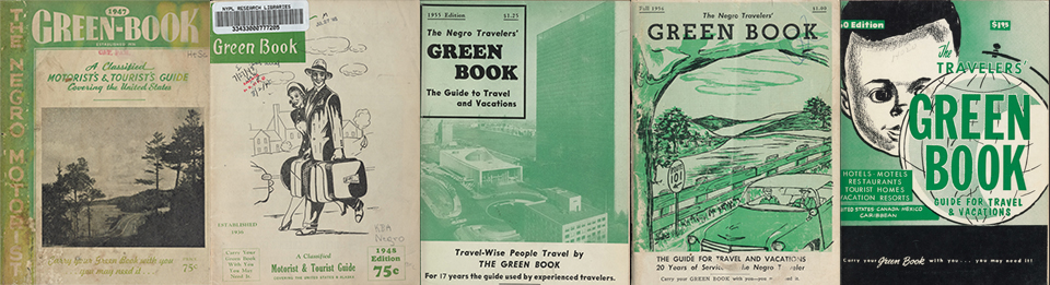
Navigating the Green Book is an interactive project by NYPL labs that targets Americans-especially those interested in African American history. The goal of the site is to invite people to learn and experience in a small way a part of African American history through the use of Green Books. Green Books were travel guides directing African American travelers to safe locations to rest, obtain gas, shop and eat as they traversed the dangerous American roads between 1936 and 1966. The site wants the viewers to engage the data they are sharing and place yourself in the shoes of a black traveler in the 1930s or 1950s. They want you to think of all that places you can go and all the places that are inaccessible based on the color of your skin. The site also encourages you plan a virtual trip with the Green Book as your guide.

Navigating the Green Book has a simple interface. The home screen describes what the project is and what their goals are. There are two tabs you can press from this main screen. Clicking the “View the Map” tab will show the entire data-set of places NYPL has scanned from the pages of Green Books. The other tab invites guests to “Map a Trip.” When using this feature, guests choose a starting point and destination. Then a GPS-like map appears and you can see what roads you need to take and what places are available to you along your trip. It is a well-done feature that shows you what sections of America a black person might want to avoid. The map has an interactive icon indicating if a place is a bar, hotel or restaurant. It’s fascinating to note that some places of rest are not actually hotels but people who opened their homes to travelers. Clicking on the links provides additional information about the place and links you to the actual Green Book that a particular listing was scanned from. You can also decide what year you are traveling in and based on that, the site will have different available places to stop along your virtual trip.

If you do not want to plan a trip you are encouraged to click the “View the Map” tab. This takes you to a map of the United States and shows 796 locations that NYPL has currently uploaded. This feature highlights the locations of interest through a cluster of points spread over a given area or you can view the places through a heatmap. This shows a general area where more resources would be available to the African American traveler. This view only shows Green Book data from 1947.

The site notes they are still digitizing Green Books and invites visitors to check out the digitized data from at least 21 Green Books so far. The site uses the simplest of images, but they are effective. The site has the benefit of working from a smart phone. The site could provide more contextualization in explaining the necessity of the Green Book but the site chose to focus on exploring the words alone from the Green Books and I think it is a valuable experience. Navigating the Green Book offers a glimpse into a part of African American history that is not often discussed in classrooms. I would recommend that any one with an interest in history check out the site and see where the Green Book can take you.

Digital Review: Performing Archive: Curtis + “the vanishing race”

Screen capture of Performing Archive: Curtis + “the vanishing race,” taken 2020

Performing Archive: Curtis + “the vanishing race”. https://scalar.usc.edu/works/performingarchive/index. Created and maintained by Claremont Center for Digital Humanities. https://scalar.usc.edu/works/performingarchive/acknowledgements. Reviewed February 2020.

The Performing Archive: Curtis + “the vanishing race” project emerged in 2018 with funding from the Andrew W. Mellon Foundation. This project serves as a digital archive for the photographic works of Edward S. Curtis, and as a virtual exhibit space for work that responds to Curtis’ exploitation of Native American tribes. This interpretive work questions concepts of permission and consent for the Native peoples in question and serves as a meta commentary on the digital humanities.

The site features over 2,500 digitized archival items from seven institutions. Users can search these items using keywords or use the site’s visualization tool to explore how items interconnect with one another. These tools are immediately accessible, but the site’s layout encourages users to read the “Introduction” page before embarking on their personalized journey. The “Introduction” page gives an overview of the project’s background and goals, then details how to use the site most effectively. While you can search at any time, there are “paths” that lead to different items and exhibits. The user is put on a pre-set path through a few exhibits, putting the most critical and contextual work first. By clicking on the links inside the exhibit texts, the user can deviate from the set path to explore new items and interpretive pieces. This method exploration allows the user to dive a bit deeper into the incredible volume of content available within this project.

This site’s content is extensive because the creators have allowed the public to contribute their research and interpretation of Curtis’ work using a review process to control what occupies their site. These interpretive pieces can be found using the visualization tool and the search bar, leading to topics from YouTube to Curtis’ conceptions of race. If a user isn’t quite ready to publish their own research, they can use the comments function to give feedback and input without investing as much time as engaging in original research. In these ways, the project welcomes all people to become a part of this project. The site also features resources for working with Native stakeholders, and plans to contact Native peoples for future work, emphasizing the need for their input and consent in projects dealing in Native history. By showing their practices clearly, the project welcomes Native users, reassuring them that while Curtis was exploitative, modern creators and historians can and should be better. This project certainly acheives these goals.

Performing Archive: Curtis + “the vanishing race” is completely transparent in their methodology, which preserves the trustworthy image of this initiative. The design and methods are incredibly strong, with the only drawback to the site being the visualization tool’s loading time, which at worst can take over a minute. The user can choose how they want to interact and contribute, which is a huge plus for engagement. This type of project has no equivalent in the physical world, making use of online tools for increased engagement and thoughtful interpretation. Performing Archive: Curtis + “the vanishing race” serves as proof of what Digital Humanities at its best is capable of.

Keep the Pulse. The One Orlando Collection Review

Keep the Pulse. The One Orland Collection http://oneorlandocollection.com/ The Orange County Regional History Center, February 17, 2020

Keep the Pulse is a digital gallery honoring the victims and survivors of the June 12, 2016 mass murder at Pulse Nightclub in Orlando, Florida. The home page provides us with an image of a vigil with brief text describing the digital library and asking the site’s visitors to #Rememberthe49. Its imagery and sparse description is impactful, setting the tone for the rest of the website. If you scroll down, more information is provided, including the victims and their names, and access to the digital library, which commemorates the lives of the victims, as well as the LGBTQIA+ community coming together to mourn and rise up. The rest of the homepage provides information on the conservation process and how one can connect on social media, volunteer, or donate. Keep the Pulse is a heartfelt tribute to the victims and survivors of June 12, 2016 that inspires visitors to reflect and support the community of Orlando.

The Homepage to “Keep the Pulse.” sets a somber and reflective tone.

When arriving to the homepage of Keep the Pulse and seeing the photo of the vigil, visitors to the site will notice the care and reverence taken to make the digital gallery a place for reflection and respect. The name of the gallery is located on the top left of the homepage in white serif font with the colors of the LGBTQIA+ flag running vertically to its left side. The title is modestly sized, giving up most of the screen to the photo of the vigil outside Pulse nightclub. In a transparent text box is the headline: #Rememberthe49. Below it is a brief description of the digital gallery and the curators. Giving the photograph of the vigil space provides visitors with a moment of reflection, as well as setting the tone for the rest of the site. On the top right of the screen is the menu bar. Right below it is the option to view the sight in Spanish. The Spanish option is an important act of inclusivity. Most of the victims of June 12 were Latinx, making the incident one that affected both the Latinx and LGBTQIA+ communities and all the intersectionalities in between. Scrolling down, the site provides access to the digital library and images of the 49 victims.

The ‘About Page’ on Keep the Pulse provides a brief description about the incident at Pulse Nightclub and shares photos of the 49 victims of that tragic night.

Scrolling down the page, the digital library provides images of the 49 victims. The highlighted image provides the name of the victim. It is here that I have my only critique of the website. I wish there were a brief bio about the victim or anecdotes written by found or biological families. I would also prefer that each image provide links to other artifacts in the digital library that are connected to the specific victim. There are several links that provide access to the digital gallery, where one can view all the artifacts or filter by category or by victim. I like the options for filtering, but people who aren’t part of the queer Orlando community may not know the victims personally. The filtering option only provides names. I would suggest providing images as well. Providing a face to the name when looking through the artifacts would humanize the experience further. After looking through the gallery, there are links that provide further information on the project, or next steps visitors would want to take.

Visitors to the Keep the Pulse digital gallery have the option to take further actions after reflecting on the events of June 12, 2016. For further information on the website’s construction, the Orange County Regional History Center provides a summation of how the gallery came to be. There isn’t a page about their ethical approach, which I feel is missing, but the site does contact information in case visitors have further questions. The digital gallery also invites people to share their reflections on social media with #Rememberthe49. The site provides suggestions, events, general information about nonprofits, and frequently asked questions. The people behind the site have considered various site visitors and provide information that will help people contribute as much, or as little, as they can.

Keep the Pulse has remained active and it appears it will continue to be active as we enter the fourth anniversary of the tragedy at Pulse Nightclub. This digital history is preserving the events of June 12th so that it won’t be soon forgotten. The site is easily navigable and provides a sense of reflection and reverence that the victims deserve. Visitors to the site can honor the victims by looking through the gallery, or taking further action, depending on their resources. The site stresses acts of love and kindness, and this digital gallery is emblematic of that notion.

Digital Review: Musical Passage

Courtesy of Musical Passage.Org

Musical Passage. http://musicalpassage.org/#. Created by Laurent Dubois, David Garner, and Mary Caton Lingold. http://musicalpassage.org/#about. Reviewed February 16, 2020.

The Musical Passage is a digital project that offers a musical transcription of early African diasporic music by enslaved Africans undertaken by slave ships to the West Indies during the Atlantic slave trade. The site also presents historical information relating to the Middle Passage as it simultaneously entwines the musical reference to the narrative. The project gives an interpretation of a rare artifact obtained by Hans Sloane’s 1707 Voyage to the Islands of Madera, Barbados, Nieves, S. Christophers, and Jamaica containing musical pieces during this historical period. The Musical Passage offers audio renditions aimed at reconstructing the sound, rhythm, and musical composition and arrangement to these early musical masterpieces. The focus resides in decoding and dissecting five musical pieces of which differ in musical style, arrangement, and tempo. Additionally, each piece of music whether instrumental or vocal gives a supplementary perception of the backstory of the songs and a conception of the instruments used at the time.

The home page of the site opens with a digital image along with metadata of Hans Sloane’s document which contains the earliest transcription of African Caribbean music as Sloane interpreted and invites the visitor to listen to the musical arrangements by clicking on the play icon. The music incorporates ambient sound of the ocean tide as the music plays giving the audience a feeling of Caribbean ambience. Users can navigate three options near the play icon which include tabs explore, read, and about. Clicking on the explore tab does not bring about additional information. As a matter of fact, nothing changes on the home page when clicking the exploration tab. Secondly, clicking the read tab will allow the user to navigate through a digital design similar to ArcGIS StoryMaps using HTML5, CSS, and libraries jQuery, Bootstrap, and FullPage.js.

The read option allows for three portions of extensive informative history concerning Han Sloane’s artifact, a book entitled Voyage to the Islands, the Middle Passage, and the history of five pieces of seventeenth century sheet music.The first portion describes how Sloane traveled to the Caribbean, specifically Jamaica, and observed the cultural practices of the enslaved African population in addition to his study of the island’s ecology. During Sloane’s time in Jamaica, he cataloged plants and animals on the island while collecting cultural artifacts and scientific specimen which can now be seen at the British Museum. The second portion is comprised of historical content of the Middle Passage and its effects on enslaved Africans. The passage depicts the cultural influence brought from their native Africa to include practices, rituals, customs, and music which influences present day vocal and instrumental sounds attached to the expression of emotion.

Finally, the third portion contextualizes the history, musical notation, engravings of some of the earliest depictions of instruments, and the song interpretation of each musical piece. The selection clarifies that the rendition of the music is by the project’s inference as it is difficult to know the precision of what the music originally sounded like. The passage invites their users to contribute their own musical interpretations for the purpose of inspiring future improvisations. Furthermore, towards the end of the narration, there is a solitary assessment of the five musical compositions illustrating differences in notation, melody, musical scale, vocal pattern, and lyric analysis. The metadata includes an image of Hans Sloane, natural history engravings of mollusk shells from his book, an engraving of three instruments he collected (no longer in existence), and five images of one bar of music for Angola, Papa, Koromanti 1, Koromanti 2, and Koromanti 3.

The about tab redirects the user to learn more about the project, its mission, project design details, musical responses to the project, collaborations, biographical information on the project’s creators, acknowledgments, a digital humanities bibliography, and further readings. The page is very detailed in its mission for the project in addition to the remaining about topics. Moreover, the project encourages its users to give feedback on their efforts or contribute further interpretations on the musical material. It cites forms of contact through twitter, their website, or through email. It also recommends that the user stream the recordings through Soundcloud. The musical response paragraph intrigued me the most as it provided additional metadata through the use of YouTube to show a video of a group of musicians invited by the Institute of Jamaica in Kingston to give a live improvisation of this music in front of an audience.

All things considered; the digital project Musical Passage is a great project! It was enjoyable learning about the inception of music and its origins considering the influences it provides to the evolution of music as it exists today. It rooted from unfortunate events by way of the Middle Passage and yet through so much pain and suffering, enslaved Africans were able to create and beautify the art of music as a form of storytelling. The diffusion of their African culture and traditions using music immortalized their place as trail blazers and pioneers of musical expression and demonstration. The project itself embellished this information providing both visual and audio support to transport the user to seventeenth century Jamaica. The goal in these digital projects are to inform and supply a deeper appreciation for the history produced by their work and this project did just that.

Spatial Digital Humanities: Embattled Borderlands

Embattled Borderlands https://storymaps.esri.com/stories/2017/embattled-borderlands/index.html. Created by Krista Schyler in collaboration with the Sierra Club, Defenders of Wildlife, the National University of Mexico, and the International League of Conservation Photographers. Reviewed Feb. 7–Feb. 17, 2020

Embattled Borderlands is a digital Story Map that documents the impacts of United States immigration and border security policies along the United States-Mexico border. This project was conducted as a national and international collaborative effort to humanize the southern border. Led by Krista Schyler, this team documented the effects immigration and border politics have had on the ecosystem, wildlife, and society along the southern border. The content of this Story Map is based on years of original documentation and research. Schyler has combined their published work with additional resources provided by their collaborators, to create a multifaceted representation of the southern border that is both visually captivating and informative.

This Story Map begins by defining what a borderland is and identifies specifically which border region will be the focus of this project. Although viewers could infer from the images and locations featured throughout the Story Map, the creator made a responsible decision by explicitly outlining the geographic scope of this project. Additionally, Schyler provided historic and ecological background into this region, which further contextualizes the geographic scope for viewers. Within this introductory section, Schyler also communicates the purpose of this project. Altogether, this first section primes viewers to absorb the content that is to follow, and assists in framing their interpretations.

The actual content is divided into eight main subjects: Tijuana, Migration, Sonoran Desert, San Pedro, Sky Islands, Chihuahua, Big Bend, and Lower Rio Grande. Each section can be accessed by scrolling through the Story Map, or by selecting a desired section from the drop-down menu at the top of the screen. Each section includes comprehensive descriptions of the political and ecological history of each region. Original images by Schyler correspond to each historical and geographical description and enhance the immersive experience. Viewers can associate an actual place to the narrative they read, thereby further identifying or sympathizing with the changing realities of the southern border. Schyler has also made this project available in Spanish.  The translated version of the information that does not compromise the format or connotations of descriptions for each town. I think this is an admirable and conscious effort to serve the regional audience.

The “Migration” section incorporates exceptional uses of digital tools to illustrate human experiences. This section includes a digital map that computes the number of migrant deaths in Arizona since 1981. This map is followed by a real-world account of one of these deaths through interviews and photos. The creator has not specified a clear chronological scope. Within each section, one can see that Schyler includes political history throughout the 20th and 21st centuries. I think the decision to organize the information by location or topic rather than by decade strengthens each individual narrative. Forgoing a timeline presents each region as active, unique moving parts within a larger narrative. Furthermore, this casts the environment as a new lens from which to analyze history.

“Migration” section of Embattled Borderlands

While I appreciate the utility of the drop-down menu, the introductory section and purpose of Embattled Borderlands is not included in this tool. Viewers could dive into the content without reviewing vital background context and not fully grasp the overall goal of this project. Furthermore, this project is missing a dedicated ‘about’ section. More information about Krista Schyler can be found at the very end of the story map, but this tidbit is informal and does not provide much scholastic background into the project. Nor can this be accessed directly through the drop-down tool.

Although the creator refrains from injecting a blatant political objective or interpretation throughout the Story Map, each section highlights the failures and injustices of American policies. Furthermore, Schyler encourages viewers to “take action” and offers ways to engage in the political conversation at the local and national level. While no political ideology is explicitly being pushed, including these resources may suggest to some that there is something wrong with the policies viewers have just encountered. However, I also think this is a way to empower individuals to also view themselves as significant pieces to the larger narrative.

Through Embattled Borderlands, Krista Schylerinvites viewers to examine border politics through the lenses of culture and the environment. Schyler and their collaborators have crafted an inclusive, informative, and personal illustration of local realities caught in between national politics. This effort is an example of effective cross-field collaboration facilitated through the means of Digital Humanities. This Story Map could be most useful for a wide range of professionals and academics within history, politics, environmental fields. At the same time, the language and content are familiar, therefore accessible enough to be grasped by local communities.  

Digital Review: Making the History of 1989

Making the History of 1989.  http://chnm.gmu.edu/1989/. Created and maintained by the Roy Rosenzweig Center for History and New Media (CHNM) at George Mason University.  http://chnm.gmu.edu/1989/about. Reviewed February 16- February 17.

The Roy Rosenzweig Center for History and New Media (RRCHNM) created the Making the History of 1989 to help educate people about what lead up to the collapse of the Soviet Union by examining the changes happening in the Eastern Bloc. The project does this by giving an overview of each country in the Eastern Bloc and how they eventually fell away from the Communist Party as well as the events that contributed to this widespread shift away from Communism. Unfortunately, the sections for Albania, Romania, and Yugoslavia are missing from the introduction. They are tabs that can be clicked on, but only a blank page is shown in response. Aside from this, the introductory section is well done, and it provides the viewer with all the necessary information to start looking at and analyzing the information in the following sections.

The next section includes primary sources relating to these events. This section presents the viewer with a list of countries to select from, showing the viewer a page with primary sources relating to the country they select. This works well because it does not just list sources under one country, but it lists that source under each country it is related to. The page also shows a “featured” source upon opening to immediately draw attention to an interesting source. The website changes the source each time the page is navigated to. This page is well done, and the only issue with it is the listing of sources under Turkey. When Turkey is selected a page with no sources pops up. Even if there are no sources for Turkey it would perhaps be simpler to not include Turkey.

The third section contains interviews with scholars, focusing on the events that lead to Communism falling apart and how they cover this topic in their classes. The website separates these interviews into segments addressing each question asked. The viewer can sort these segments either by interviewer or by theme of questions. This enables the viewer to focus on a particular topic they are interested in or a certain researcher that they want to hear from. The questions here are well thought out and the answers are very informative to the listener.

Screen allowing the user to choose what segments they want to see, sorted into two categories.

The next section contains six thorough teaching modules that let students dive deeper and explore certain elements of this time period and opens discussion on how these events tie into the larger themes seen in the collapse of Communism. These teaching modules provide a lecture, multiple primary sources, teaching strategies, a lesson plan, and questions for the students to discuss and write about. The module makes sure to note where the research comes from and provides credit to those who helped create it. These modules challenge students to think and add variety, so the class is more than the teacher giving a lecture.

The last section provides twelve case studies that seem to be similar to the teaching modules. They are geared towards educators by providing primary sources, lecture portions, and a reflection section. They seem to contain fewer instructions so the students can focus on examining the sources and drawing their own conclusions for discussion.

The project is a great use of technology considering most of the information and content was created in 2007. There are some sections missing, as discussed above, but there is not a certainty if this is due to old code or if these sections were overlooked. A similar idea to the lesson plans could have been done physically, but this would have made them less accessible. The current format targets educators but provides enough information that it would be useful for anyone interested in this area of European history. The project should consider adding subtitles to the interviews so that people who are deaf or heard of hearing also have access to the information within. The many members, both faculty and students, of the RRCHNM did a great job in creating this project by allowing it to appeal to members of multiple audiences.

The 9/11 Digital Archive: A Tribute to the 9/11 Disaster

The September 11 Digital Archive, https://911digitalarchive.org/, Roy Rosenzweig Center for History and New Media and American Social History Project/Center for Media and Learning, https://911digitalarchive.org/about , consulted on February 16, 2020

The Library of Congress inaugurated the 9/11 Digital Archive in 2003. The archive is a virtual smorgasbord of materials related to the events of September 11, 2001. It contains thousands of items: newspaper articles from before and after the event, pictures taken by families in front of the Twin Towers just days before the disaster, poems written in honor of first responders and fire fighters, personal compositions written by people who were effected by the events of 9/11, oral histories, news clips, and much more. In total there are over seventy thousand items in the archive. The archive is not purely scholarly, but rather acts as more of a digital home for the memories of those who experienced 9/11. As their about page states, ” The September 11 Digital Archive uses electronic media to collect, preserve, and present the history of the September 11, 2001 attacks in New York, Virginia, and Pennsylvania and the public responses to them. “

The design of the archive is simple, but it works. It is divided into different collections (for example the Anniversary Collections or the Audio Collection). Also, a visitor to the archive can browse the items without having to chose a particular collection; all text submissions, oral histories, videos clips, and photos will be mixed together, instead of being separated into different collections. Interestingly, the archive also has links to additional collections complied from outside sources, and a crowd sourced collection open for visitors to the digital archive to add their own memories of 9/11. Browsing through this collection, a visitor finds memories that are only a few sentences long, and these are usually not composed by those who participated in the events first hand, but instead by those who experienced the events from their T.V. screens or even half way across the world. This is significant, as it reminds the visitor of how far reaching 9/11 was for the American people. The archive also has the usual archive search option and an about page describing how the archive was compiled as well as a staff page thanking the team that put together and currently oversees the archive.

The audience for the 9/11 digital archive is extremely diverse. It is meant for all people who remember the events of 9/11. It is not merely limited to those who participated in the events first hand. This is evidenced by the sheer number of items in the archive, as well as the different kinds of submissions; many of which are written by or submitted by ordinary Americans who experienced 9/1 1. These submissions, as noted above, range from oral submissions to simple text submissions. However, all the submissions offer insight into how Americans viewed 9/11, both then and now.

The archive, as mentioned before, has a simple layout. However, it has a unique history in that it was the first digital archive to be accepted into the Library of Congress, thus helping to insure that it would be preserved for posterity. In 2011, the archive was moved to Omeka, where the website was relaunched on a more stable platform. This fathered the project team’s goal of preserving the archive and these memories forever.

The original team that put together the 9/11 Digital Archive is made up mostly of archive and meta data experts from George Mason University’s Center for History and New Media as well as historians, investigators, programmers, and web designers from City University of New York Graduate Center and John Jay College, City of New York University. Today, the project is overseen by a team from the Roy Rosenzweig Center for History and New Media. The 9/11 digital archive has also attracted many influential partners such as the Library of Congress and The Smithsonian Institute which have helped to preserve and grow the archive. Additionally, visitors to the archive can make their own contributions thus adding their voices and their stories to the it..

The 9/11 Digital Archive is a simple, well organized, and meaningful archive that successfully catalogs the emotional turmoil felt by a nation and its people during one of the most tragic days in its history.

A Screenshot taken by the author of the 9/11 Digital Archive’s Home Page, taken February 16, 2020 | Screen shot taken by author

The Beautiful Game

Society for American Soccer History. https://www.ussoccerhistory.org/. The Society for American Soccer History (SASH). https://www.ussoccerhistory.org/store/sash-membership-one-year/. Reviewed February 12- 17, 2020.

Since I was five years old, sports, specifically soccer, has played a major role in my life. Soccer, also known as the “beautiful game,” is the world’s most popular sport and has helped shaped my education and career. Playing soccer and running cross-country in high school, earned me a Division-1 athletic scholarship for college and provided me an amazing experience as a student-athlete. Today, I serve as the assistant women’s soccer coach at St. Mary’s University and continue to be thankful for what the sport of soccer has done for me. So, I was pleased to locate a website devoted to the sport of soccer. The Society for American Soccer History (SASH) site has compiled a variety of research resources recommended for anyone interested in acquiring a broader context for American soccer history.

Soccer historian Sam T.N. Foulds founded the Society for American Soccer History in 1993. Today, nine board members from various parts of the country govern SASH. To help continue the growth of soccer history and build upon the organization, the SASH Board meets several times a year. During these meetings, SASH collaborates with the National Soccer Hall of Fame (NSHOF), encourages supporters to become annual members, and uses different avenues of communication through journals, newsletters, and future SASH conferences/events. The mission statement of SASH is clearly defined: 1) “To stimulate, promote, and coordinate interest in the historical study of soccer in the United States,” and 2) “To advance scholarship in the study and teaching of various aspects of soccer history.” To achieve this, SASH preserves and catalogs various historical records, publishes literature, and provides a forum for collaboration, discussion, and research within the field of history for U.S. soccer.    

Simple and basic in its design, the SASH site is filled with a variety of resources to help report on historical research on U.S. soccer. Examples include, archive photos with past and present articles, hundreds of biographies on National Soccer Hall of Fame players, coaches, and “builders” of the game, archive video recordings of games and interviews, online newspaper resources, tournament and Olympic game results, and roster information from different leagues. As a huge supporter of both the Men’s and Women’s U.S. National Soccer teams, I was impressed to discover team results dating as far back to 1885 to present. In addition, the SASH site provides the user with “The Spalding Guides” which was the yearbook for U.S. soccer from 1904 – 1924. I found this to be especially interesting, containing information on local and national topics, such as rules of the game, statistics, and events from international soccer.

For a $20 membership fee, one can join SASH and receive the SASH newsletter, ability to vote in upcoming SASH elections, and discounted rates to attend SASH conferences. Most recently the conference was held at Toyota Stadium in Frisco, TX. In addition, SASH provides a “contact” page for any questions one may have. The site also allows a user to be directed to shop for a variety of SASH fan apparel such as NIKE-sponsored polo’s, t-shirts, jackets, hoodies, pants, and hats. When exploring this option, SASH has teamed up with Soccer.com to allow users to shop and purchase such items for men and women. Using Soccer.com in the past, I found this to be a great marketing tool for SASH in helping promote the organization through a popular and well-established site in Soccer.com.

The SASH site primarily targets soccer enthusiasts, providing an abundance of historical facts and figures through a variety of digital media platforms. The site is not “flashy” in terms of color, and user-interaction. Instead, SASH provides a total of 8 tabs, including the “home” page with several drop-down menu options depending on which tab one selects. While I do appreciate the site’s simplicity and user-friendly design, I feel SASH should provide more information under its “about” page. I would like to read and learn more on the origins of SASH such as the founder, Sam T.N. Foulds, and perhaps why and how he thought of creating SASH. In addition, too few women are represented under the player biographies. Instead, the site has centered its focus on men when women hold just as much value and importance in the history of U.S. soccer. 

It must not be overlooked currently, the most than any other country, the United States Women’s National soccer team holds four world cup titles. Women continue to fight for equal pay from the likes of soccer “superstars” in Carli Lloyd, Megan Rapinoe, and Alex Morgan. Examples like these pieces of history most certainly deserve to be found and recognized within the SASH site. 

What makes soccer so great is how global the “beautiful game” is. Soccer, football, or futbol, as it is called in some parts, is the most watched, televised, and played sport in the world. Because of this, I feel SASH could reach a much larger audience if they include more international history on the site. Instead, SASH is limiting its growth by only focusing on U.S. soccer and its history. 

In the public history field, we are often taught engagement and understanding your audience should always come first. Soccer, like history is dynamic and always changing. I have been able to make a career coaching soccer and love what I do. The “beautiful game” has shown me places and people I would have never seen while helping me grow as a person. Therefore, I do hope SASH continues to grow and evolve not just within its organization but also with its informative and interesting site.   

css.php