Social Media and Museums

Instagram for Museums https://digitalpathways.weareculture24.org.uk/instagram-for-museums/. Posted by Digital Pathways.

Social Media for Museums: An Overview https://digitalpathways.weareculture24.org.uk/social-media-overview/. Posted by Digital Pathways. 

Should Museums Have a Personality https://medium.com/@RussellDornan/museumpersonality-87ab2112ee9e. By Russell Dornan.

The Ultimate Guide to Instagram Hashtags in 2020 https://via.hypothes.is/https://later.com/blog/ultimate-guide-to-using-instagram-hashtags/ By Benjamin Chacon. 

This week’s readings provided a guide for strategizing how to transfer a museum’s image onto social media platforms. These authors interpret ‘image’ as a museum’s mission, the culture of the institution. With a focus on Instagram, these articles collectively offer a multilayered introduction to the many advantages of branding your organization on this platform. These readings brought forth some of the most fundamental lessons in public history in extending the ethics of traditional methods of community outreach, networking within the profession, and producing original work. Furthermore, these readings also capture the importance of using the platform to strengthen interpersonal relationships between the museum and the people they serve.

Instagram for Museums and Social Media for Museums: An Overview, both published on Digital Pathways (unknown individual author) serve as a more general overview for museum employees in taking the first step of starting an Instagram page. I felt that the objective of these two articles were to persuade museum employees to take the first step of signing up on this platforms. By breaking down Instagram’s usability and promotional advantages, these articles highlight Instagram as a simple, accessible, and effective tool for growing a museum’s community. ‘Community’ refers to the professional and local community of which museums are situated in. One thing that I really like from Social Media for Museums: An Overview is the attention to audience and inclusivity. I think it’s important to highlight the history of exclusion of certain demographic groups, and to recognize the outreach that could be achieved through social media. 

Russell Dornan’s Should Museums Have a Personality and Benjamin Chacon’s The Ultimate Guide to Instagram Hashtags in 2020 provide more minute details for maintaining your museum’s Instagram profile. Dornan, I feel, focuses more on the creativity aspect of producing content and writing captions across various social media platforms. I think this article serves as a lesson in consistency and appropriate language. Two very important factors in conducting public history that are applicable to digital platforms. Chacon’s article, on the other hand, is a more analytical approach to using Instagram to grow your following. Chacon offers probably  the most ‘advanced’ or in depth approach to growing your following, and keeping track of your museum’s social media activity. I really like how Chacon pulls back the curtain of average Instagram posts and captions to dissect how to take advantage of Instagram’s algorithm. Both of these authors do a very good job at providing an example of each of their methods. These authors provide readers with a new perspective to the simplest functions by sharing their approach for using the most common features across social media (Twitter threads, the explore page, hashtags, etc). I think this makes readers feel that they too can maintain an effective profile. 

I really like how all four authors stress that social media is not just about marketing. Each article highlights that maintaining an element of ‘fun’ in effort to ‘humanize’ museums, and maintain memorable social media presence. Each article recognizes that there are actual people behind the accounts that follow, or could potentially follow, the museum. While social media is great for establishing first impressions, this activity should continue this effort with real world interactions.

Spatial Digital Humanities: Embattled Borderlands

Embattled Borderlands https://storymaps.esri.com/stories/2017/embattled-borderlands/index.html. Created by Krista Schyler in collaboration with the Sierra Club, Defenders of Wildlife, the National University of Mexico, and the International League of Conservation Photographers. Reviewed Feb. 7–Feb. 17, 2020

Embattled Borderlands is a digital Story Map that documents the impacts of United States immigration and border security policies along the United States-Mexico border. This project was conducted as a national and international collaborative effort to humanize the southern border. Led by Krista Schyler, this team documented the effects immigration and border politics have had on the ecosystem, wildlife, and society along the southern border. The content of this Story Map is based on years of original documentation and research. Schyler has combined their published work with additional resources provided by their collaborators, to create a multifaceted representation of the southern border that is both visually captivating and informative.

This Story Map begins by defining what a borderland is and identifies specifically which border region will be the focus of this project. Although viewers could infer from the images and locations featured throughout the Story Map, the creator made a responsible decision by explicitly outlining the geographic scope of this project. Additionally, Schyler provided historic and ecological background into this region, which further contextualizes the geographic scope for viewers. Within this introductory section, Schyler also communicates the purpose of this project. Altogether, this first section primes viewers to absorb the content that is to follow, and assists in framing their interpretations.

The actual content is divided into eight main subjects: Tijuana, Migration, Sonoran Desert, San Pedro, Sky Islands, Chihuahua, Big Bend, and Lower Rio Grande. Each section can be accessed by scrolling through the Story Map, or by selecting a desired section from the drop-down menu at the top of the screen. Each section includes comprehensive descriptions of the political and ecological history of each region. Original images by Schyler correspond to each historical and geographical description and enhance the immersive experience. Viewers can associate an actual place to the narrative they read, thereby further identifying or sympathizing with the changing realities of the southern border. Schyler has also made this project available in Spanish.  The translated version of the information that does not compromise the format or connotations of descriptions for each town. I think this is an admirable and conscious effort to serve the regional audience.

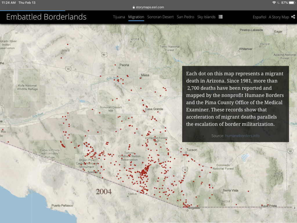
The “Migration” section incorporates exceptional uses of digital tools to illustrate human experiences. This section includes a digital map that computes the number of migrant deaths in Arizona since 1981. This map is followed by a real-world account of one of these deaths through interviews and photos. The creator has not specified a clear chronological scope. Within each section, one can see that Schyler includes political history throughout the 20th and 21st centuries. I think the decision to organize the information by location or topic rather than by decade strengthens each individual narrative. Forgoing a timeline presents each region as active, unique moving parts within a larger narrative. Furthermore, this casts the environment as a new lens from which to analyze history.

“Migration” section of Embattled Borderlands

While I appreciate the utility of the drop-down menu, the introductory section and purpose of Embattled Borderlands is not included in this tool. Viewers could dive into the content without reviewing vital background context and not fully grasp the overall goal of this project. Furthermore, this project is missing a dedicated ‘about’ section. More information about Krista Schyler can be found at the very end of the story map, but this tidbit is informal and does not provide much scholastic background into the project. Nor can this be accessed directly through the drop-down tool.

Although the creator refrains from injecting a blatant political objective or interpretation throughout the Story Map, each section highlights the failures and injustices of American policies. Furthermore, Schyler encourages viewers to “take action” and offers ways to engage in the political conversation at the local and national level. While no political ideology is explicitly being pushed, including these resources may suggest to some that there is something wrong with the policies viewers have just encountered. However, I also think this is a way to empower individuals to also view themselves as significant pieces to the larger narrative.

Through Embattled Borderlands, Krista Schylerinvites viewers to examine border politics through the lenses of culture and the environment. Schyler and their collaborators have crafted an inclusive, informative, and personal illustration of local realities caught in between national politics. This effort is an example of effective cross-field collaboration facilitated through the means of Digital Humanities. This Story Map could be most useful for a wide range of professionals and academics within history, politics, environmental fields. At the same time, the language and content are familiar, therefore accessible enough to be grasped by local communities.  

Digital Mapping: Placing Segregation

Placing Segregation, dsps.lib.uiowa.edu/ placingsegregation/omaha/. Created by the University of Iowa. Data produced by geocoding census records and GIS mapping. Reviewed January 21–27, 2020.

The University of Iowa’s Placing Segregation project is a digital narrative that provides a spatial representation of racially mixed communities within Washington D.C., Nashville, Tennessee, and Omaha between  1860–1870. This project displays the racial, income, and occupational information from census records. Additionally, the University of Iowa team cross-referenced census information to corresponding records from city directories, and manually combined their findings to create a new dataset. Using this data, the team has illustrated their findings onto digitized historical maps from this era. The team chose historic maps that  most accurately align with the current layout of each city, so that residents viewing this information recognize these areas and draw deeper connections with these places. This project aims to digitally represent racial divisions within each of these three cities by reinterpreting traditional primary sources. This project provides new layers of historical significance to these maps by connecting the spaces to the culture of the area. The digital platform utilized to carry out this project is a standalone website, affiliated with the University of Iowa.

This team is transparent in sharing  their methods of research and the reasons behind their design choices for these visualizations. As mentioned above, this project utilizes census records to gather familial and racial records and city directories to gather income. Initially, the team decided that revealing details of each individual resident, would have displayed too much information, overwhelming viewers. Rather than identifying every single person, the team chose to organize demographic information under a collective household name — usually, the head of the household. I think this makes each visual easier to follow, holding the audience’s interest, while representing the familial dynamics of that era. However, this kind of organization privilege male residents, since most females were not homeowners or financially independent. Furthermore, the site does not show exactly how many people lived in one household, which could serve as an additional indicator of wealth disparity. 

In terms of visuals and the design of the website, this resource will be easily navigable for a variety of audiences. The website is compatible with desktop and mobile devices. Both formats utilize very similar layouts to display the information. The menu is clearly visible at the top of the page, where viewers can access all aspects of the project including: all three city maps, background information, contributing members to the project, methodology, the intended interpretation of the data, and further educational exercises. However, the “Exercise” tab appears to be empty. I’d recommend the project creators fill the gap with a note that this section is a work in progress.

Navigating through the maps and the information this project displays is also fairly straightforward and uniform. At the top left corner of each map, a key presents different demographic information regarding race and class. As you select each category, the blue dots that correspond to each demographic turn yellow. This program is simple yet effective in differentiating each group, and helping audiences visualize the racial divisions within each city. The visual stimulus also makes it easy and enticing for audiences to further their inquiry. Clicking a dot will open side boxes with additional details for each resident. 

It seems that one target audience may be the current residents of these cities since the team made a particular effort to choose a historical map that most closely fits each contemporary grid. This team took an extra step to imbed a modern grayscale map that represents the current landscape of each city, which facilitates a deeper connection to this information. I also think this melding of historic and modern visualizations familiarizes each area for anyone within the United States, facilitates intra-state connections.  Additionally, this website identifies itself as a reliable source for research. As explicitly communicated in the website’s methods statement: “The research therefore has the effect of creating a resource for historical inquiry, and it enables immediate analysis of the study areas.” One way this site provides specialized services for its academic or scholarly audience is by offering alternative versions of the information as downloadable spreadsheets, which can be accessed within the main menu. 

There is not a clear indication as to why these particular cities were chosen for the project. No where within any menu options does the team express a clear mission statement. The team only elaborates on what this information could do, not necessarily what they’d like it to do. The website does, however, provide historical context of each map. Under the “Interpretations” section of the menu, the team breaks down the landscape, infrastructure, and economic activities of each city and how they influenced the way racial lines were drawn in each city. Thinking temporally and geographically, I’m inferring that these three cities were chosen to represent three separate regions of the United States pre and post Civil War. This could be a really unique method for analyzing social relations before and after the war. However, each map represents different years within 1860-1870. They are not representing the same year or providing a “before and after” of each map.

Despite some minor flaws, Placing Segregation provides a unique perspective on racial dynamics. By examining certain areas of the country that do not particularly fall within the Deep South,—where the action occurred—brings attention to the outliers of northern and southern tensions. Furthermore, this project may invoke present-day residents of these cities to evaluate the underlying foundations of contemporary social patterns. No set of data will lead any team to create a perfect reinterpretation of history. However, the team at the University of Iowa has effectively employed digitization to create a space for disregarded narratives.


css.php