The 9/11 Digital Archive: A Tribute to the 9/11 Disaster

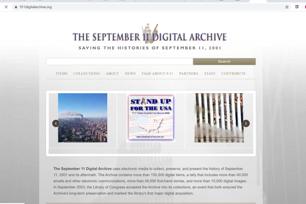
The September 11 Digital Archive, https://911digitalarchive.org/, Roy Rosenzweig Center for History and New Media and American Social History Project/Center for Media and Learning, https://911digitalarchive.org/about , consulted on February 16, 2020

The Library of Congress inaugurated the 9/11 Digital Archive in 2003. The archive is a virtual smorgasbord of materials related to the events of September 11, 2001. It contains thousands of items: newspaper articles from before and after the event, pictures taken by families in front of the Twin Towers just days before the disaster, poems written in honor of first responders and fire fighters, personal compositions written by people who were effected by the events of 9/11, oral histories, news clips, and much more. In total there are over seventy thousand items in the archive. The archive is not purely scholarly, but rather acts as more of a digital home for the memories of those who experienced 9/11. As their about page states, ” The September 11 Digital Archive uses electronic media to collect, preserve, and present the history of the September 11, 2001 attacks in New York, Virginia, and Pennsylvania and the public responses to them. “

The design of the archive is simple, but it works. It is divided into different collections (for example the Anniversary Collections or the Audio Collection). Also, a visitor to the archive can browse the items without having to chose a particular collection; all text submissions, oral histories, videos clips, and photos will be mixed together, instead of being separated into different collections. Interestingly, the archive also has links to additional collections complied from outside sources, and a crowd sourced collection open for visitors to the digital archive to add their own memories of 9/11. Browsing through this collection, a visitor finds memories that are only a few sentences long, and these are usually not composed by those who participated in the events first hand, but instead by those who experienced the events from their T.V. screens or even half way across the world. This is significant, as it reminds the visitor of how far reaching 9/11 was for the American people. The archive also has the usual archive search option and an about page describing how the archive was compiled as well as a staff page thanking the team that put together and currently oversees the archive.

The audience for the 9/11 digital archive is extremely diverse. It is meant for all people who remember the events of 9/11. It is not merely limited to those who participated in the events first hand. This is evidenced by the sheer number of items in the archive, as well as the different kinds of submissions; many of which are written by or submitted by ordinary Americans who experienced 9/1 1. These submissions, as noted above, range from oral submissions to simple text submissions. However, all the submissions offer insight into how Americans viewed 9/11, both then and now.

The archive, as mentioned before, has a simple layout. However, it has a unique history in that it was the first digital archive to be accepted into the Library of Congress, thus helping to insure that it would be preserved for posterity. In 2011, the archive was moved to Omeka, where the website was relaunched on a more stable platform. This fathered the project team’s goal of preserving the archive and these memories forever.

The original team that put together the 9/11 Digital Archive is made up mostly of archive and meta data experts from George Mason University’s Center for History and New Media as well as historians, investigators, programmers, and web designers from City University of New York Graduate Center and John Jay College, City of New York University. Today, the project is overseen by a team from the Roy Rosenzweig Center for History and New Media. The 9/11 digital archive has also attracted many influential partners such as the Library of Congress and The Smithsonian Institute which have helped to preserve and grow the archive. Additionally, visitors to the archive can make their own contributions thus adding their voices and their stories to the it..

The 9/11 Digital Archive is a simple, well organized, and meaningful archive that successfully catalogs the emotional turmoil felt by a nation and its people during one of the most tragic days in its history.

A Screenshot taken by the author of the 9/11 Digital Archive’s Home Page, taken February 16, 2020 | Screen shot taken by author

The Beautiful Game

Society for American Soccer History. https://www.ussoccerhistory.org/. The Society for American Soccer History (SASH). https://www.ussoccerhistory.org/store/sash-membership-one-year/. Reviewed February 12- 17, 2020.

Since I was five years old, sports, specifically soccer, has played a major role in my life. Soccer, also known as the “beautiful game,” is the world’s most popular sport and has helped shaped my education and career. Playing soccer and running cross-country in high school, earned me a Division-1 athletic scholarship for college and provided me an amazing experience as a student-athlete. Today, I serve as the assistant women’s soccer coach at St. Mary’s University and continue to be thankful for what the sport of soccer has done for me. So, I was pleased to locate a website devoted to the sport of soccer. The Society for American Soccer History (SASH) site has compiled a variety of research resources recommended for anyone interested in acquiring a broader context for American soccer history.

Soccer historian Sam T.N. Foulds founded the Society for American Soccer History in 1993. Today, nine board members from various parts of the country govern SASH. To help continue the growth of soccer history and build upon the organization, the SASH Board meets several times a year. During these meetings, SASH collaborates with the National Soccer Hall of Fame (NSHOF), encourages supporters to become annual members, and uses different avenues of communication through journals, newsletters, and future SASH conferences/events. The mission statement of SASH is clearly defined: 1) “To stimulate, promote, and coordinate interest in the historical study of soccer in the United States,” and 2) “To advance scholarship in the study and teaching of various aspects of soccer history.” To achieve this, SASH preserves and catalogs various historical records, publishes literature, and provides a forum for collaboration, discussion, and research within the field of history for U.S. soccer.    

Simple and basic in its design, the SASH site is filled with a variety of resources to help report on historical research on U.S. soccer. Examples include, archive photos with past and present articles, hundreds of biographies on National Soccer Hall of Fame players, coaches, and “builders” of the game, archive video recordings of games and interviews, online newspaper resources, tournament and Olympic game results, and roster information from different leagues. As a huge supporter of both the Men’s and Women’s U.S. National Soccer teams, I was impressed to discover team results dating as far back to 1885 to present. In addition, the SASH site provides the user with “The Spalding Guides” which was the yearbook for U.S. soccer from 1904 – 1924. I found this to be especially interesting, containing information on local and national topics, such as rules of the game, statistics, and events from international soccer.

For a $20 membership fee, one can join SASH and receive the SASH newsletter, ability to vote in upcoming SASH elections, and discounted rates to attend SASH conferences. Most recently the conference was held at Toyota Stadium in Frisco, TX. In addition, SASH provides a “contact” page for any questions one may have. The site also allows a user to be directed to shop for a variety of SASH fan apparel such as NIKE-sponsored polo’s, t-shirts, jackets, hoodies, pants, and hats. When exploring this option, SASH has teamed up with Soccer.com to allow users to shop and purchase such items for men and women. Using Soccer.com in the past, I found this to be a great marketing tool for SASH in helping promote the organization through a popular and well-established site in Soccer.com.

The SASH site primarily targets soccer enthusiasts, providing an abundance of historical facts and figures through a variety of digital media platforms. The site is not “flashy” in terms of color, and user-interaction. Instead, SASH provides a total of 8 tabs, including the “home” page with several drop-down menu options depending on which tab one selects. While I do appreciate the site’s simplicity and user-friendly design, I feel SASH should provide more information under its “about” page. I would like to read and learn more on the origins of SASH such as the founder, Sam T.N. Foulds, and perhaps why and how he thought of creating SASH. In addition, too few women are represented under the player biographies. Instead, the site has centered its focus on men when women hold just as much value and importance in the history of U.S. soccer. 

It must not be overlooked currently, the most than any other country, the United States Women’s National soccer team holds four world cup titles. Women continue to fight for equal pay from the likes of soccer “superstars” in Carli Lloyd, Megan Rapinoe, and Alex Morgan. Examples like these pieces of history most certainly deserve to be found and recognized within the SASH site. 

What makes soccer so great is how global the “beautiful game” is. Soccer, football, or futbol, as it is called in some parts, is the most watched, televised, and played sport in the world. Because of this, I feel SASH could reach a much larger audience if they include more international history on the site. Instead, SASH is limiting its growth by only focusing on U.S. soccer and its history. 

In the public history field, we are often taught engagement and understanding your audience should always come first. Soccer, like history is dynamic and always changing. I have been able to make a career coaching soccer and love what I do. The “beautiful game” has shown me places and people I would have never seen while helping me grow as a person. Therefore, I do hope SASH continues to grow and evolve not just within its organization but also with its informative and interesting site.   

Digital Review of Lynching in America

Lynching in America. https://lynchinginamerica.eji.org/about Created and maintained by The Equal Justice Initiative with support from Google. Reviewed January 27, 2020.

The Lynching in America project is an interactive site targeting an audience of educators as well as Americans more broadly. It was created by the Equal Justice Initiative (EJI), a nonprofit organization working to fight racial injustice while also providing legal representation to the unjustly incarcerated. Lynching in America’s goal is to educate and relay information regarding the racial terrorism that African Americans endured between the Civil War and World War II. The project also connects the lynchings of the past with more recent forms of racial injustice like the disproportionate sentencing, and the police brutality. The project’s creators hope that by teaching this history the past will not be forgotten and it will not be repeated. In the words of Bryan Stevenson, EJI’s founder, “we cannot heal the deep wounds inflicted during the era of racial terrorism until we tell the truth about it.”

The project consists of six major sections and visitors can easily navigate directly to any of the six after a short introductory message on the home screen. The top three sections contain personal stories and interactive maps while the bottom three contain lesson plans and teaching tools for educators along with information about EJI and their organization’s mission.

A couple of the personal stories connect living family members with one of their family members who was lynched in the past. The videos highlight how senseless and brutal the attacks on African Americans were and how the violence affected those who knew them. Learning that no punishment came to those committing the acts is even more heartbreaking to witness. There is also a video about Anthony Hilton, a man who served thirty years in jail for a crime he did not commit. The officers made it clear that his incarceration was based on his racial identity. The videos are well produced and invoke a range of emotions from sadness to anger to frustration that such systemic racism exists in the modern era. By including Mr. Hilton’s story, the site purposes to show “lynching” can take different forms.

The interactive map section is visually appealing and simple to navigate. The map highlights counties where lynching occurred in different hues of red. By clicking on a highlighted county, the visitor sees how many people were lynched in that county. The map does not tell you anything about the victims lynched in that county unlike Monroe Work Today (http://www.monroeworktoday.org/explore/) which gives details about the victims and their alleged crime. Since databases exist with such data, the info was willfully not included or perhaps an oversight by the site editors. The project is clearly well-researched as the site contains over 300 footnotes but it would be beneficial to include some of the additional data on the people who were lynched.

The inclusion of lesson plans for educators is a useful tool. However, because the project only presents evidence and stories regarding the injustice of African Americans, it alienates the Mexican American and other ethnicities who were victims of racial violence and systemic oppression. For a project called Lynching in America, the American experience the site describes is not inclusive of all marginalized groups. Martin Luther King reminds us:

 “Injustice anywhere is a threat to justice everywhere. We are caught in an inescapable network of mutuality, tied in a single garment of destiny. Whatever affects one directly, affects all indirectly.”

I’m not sure if EJI ever plans to expand this project, but further additions would be welcome. It is a well-done project for many reasons. The facts provided are solid. The various video narratives are deeply moving, and the camerawork is exceptional. The information provided on the Great Migration of African American from the South to the North is well written. I am certain that EJI advocates for all people and it would be great if the Lynching in America project reflected that ideology more clearly.

Exploring the Chicago Latino ArTchive

Chicago Latino ArTchive: A Century of Chicago Latino Art https://iuplr.org/chicago-artchive/artchive/index/chicagolatinoartchive.html Organized by the Inter-University Program for Latino Research (IUPLR) headquartered at the University of Illinois at Chicago. Reviewed January 27, 2020.

Growing up in Chicago, I may have taken for granted the easy access I had to history, art, and culture. The city is rich in heritage and there are various organizations that help preserve a specific cultural group’s identity and impact upon the city. The National Museum of Mexican Art, for example, is a cornerstone of the Pilsen neighborhood. In my own backyard, I had the privilege of having access to an institution that helps celebrate Chicago’s Latinx community. The amount of work Latinxs have created is impressive. The museum is a well curated body of work, but it isn’t representative of all the work Chicagoans have contributed to the city’s culture. The Chicago Latino ArTchive, a repository for Chicago based Latinx works of art, was created by the Inter-University Program for Latino Research (IUPLR) to provide people with easy access to works of art, specific artists, or different time periods of Chicago Latinx art. Those who haven’t had the privilege of visiting the Nation Museum of Mexican Art, or those who want to explore Chicago Latinx art more fully, can explore the digital repository to find great works of art, which explores a more encompassing body of work that the NMMA can’t house. The repository features the work of prominent artists who were either born in Chicago or settled there. One can explore an artist’s portfolio, a specific time in the city’s history, and other exploratory options. The repository is a great start to begin research, but is limited to providing basic information without further contextualization.

The Chicago Latino ArTchive provides a home page explaining the scope of the project. First uploaded in the fall of 2016, the ArTchive celebrates all the contributions Latinxs have had in Chicago over the last century. The repository provides artist portfolios, the artist’s statement (if they provided one), biographical information, and links to artists’ personal sites. After reading the brief introductory paragraph, a list of sponsors and/or stakeholders is provided. The National Museum of Mexican Art, as well as the local Telemundo affiliate, are sponsors. After reading all that the home page provides, one can enter the ArTchive.

After entering the ArTchive, a list of the artists included in the repository is provided. The Artists’ information is provided via four different columns: Name, Gender, Country of Origin, and Decades in Chicago. Each column can be manipulated to group artists in different categories. For example, if someone wanted to explore the works of Latina artists, the Gender column will separate the artists by gender. Similarly, if someone wanted to research current artists, the Decades in Chicago column would provide easy access to artists working since 2000. By clicking on the individual artist’s name, one can enter that specific artist’s portfolio, see some samples of their work, read their statement, bio information, and visit their personal website(s), if they provided it.

Though the repository is a great introduction to artist’s work, it also has several limitations. For example, there are artists who lack bio information, an artist statement, and/or links to other sites where one can explore their work further. It seems like a lot of artists who contributed, provided as much information as they wanted. This is understandable, however, the artists who contributed very little to their biographical information, statements, or information on how to access their work, are doing themselves a disservice. Consistency would also benefit the site. The labelling on the images varies between artists and works of art. I’m speculating that the artists also labelled their own artwork. Some of them provided their name, the title of the piece, and the year it was complete or exhibited. I would like for all of the pieces to have all of this information, but some may only include the artist’s name, the title, or nothing at all. This again does the artist a disservice. It may hinder someone from exploring different works of art further, or seek out the information in a different repository.

Aside from providing the artist portfolios and being able to search via gender, time period, and country of origin, the repository can help audiences search specific types of art. As I was navigating through the repository, I wish there was a way to find similar artists. For example, if there are mural artists, I would like to be able to categorize them together. I would like to see the evolution of murals over time in Chicago and where they are located. Similarly, categorizing public sculptures together would also be beneficial. By being able to locate where public art is located throughout the city, audiences may take the incentive to visit the works of art. By creating more metadata, the repository can be more accessible to audiences and help them discover art they otherwise wouldn’t have sought out.

The Chicago Latino ArTchive is a very useful tool. Being so far away from home, it was great to explore the repository and find works of art that I’ve been familiar with throughout my whole life. It was also rewarding finding new art or artists I’ve never heard of before. Despite finding some great information in the repository, I also found myself using other sites to gain more information about specific pieces of work. I would appreciate it if the ArTchive provided that for me instead. I hope to see this repository growing and thriving as future Latinx artists continue to contribute to Chicago’s culture.

Selena: Family, Beauty, Love, and Inspiration

Celebrating Selena: Fotos y Recuerdos. https://artsandculture.google.com/exhibit/celebrating-selena-fotos-y-recuerdos/WQJyfKjwK8pFJw. The Selena Museum. https://artsandculture.google.com/partner/the-selena-museum. Reviewed January 22- 27, 2020.

I learned of Selena Quintanilla when I first watched the 1997 movie,“Selena” starring Jennifer Lopez.  Well-received from the media and public, the movie was the eventual starting point for Jennifer Lopez’s career as an actor and music artist.  I became a huge fan of Selena and her music, and I was inspired by her journey from humble beginnings to national stardom as a Mexican-American music icon.  Sadly, at the age of 23, Selena’s career was cut short when she was shot and killed.  The site however, does not include these tragic events but instead keeps a constant theme of family, beauty, love and inspiration.  Perhaps the way Selena would’ve wanted it.  The Selena Museum continues to celebrate her legacy, which, with the help of Selena’s family, has put together a collection of personal images to share for her loyal and loving fans from across the country.

Celebrating Selena: Fotos y Recuerdos is a collection of archive photos and images from The Selena Museum, highlighting Selena’s career as a musician, entertainer, entrepreneur, and philanthropist.  The site is colorful, organized, and very user friendly. One only has to “click” on the arrow to the right or left to navigate through each image.  The site starts with an “Introduction” that displays beautiful self-portrait artwork of Selena with a short description summarizing Selena’s childhood and beginnings as a Tejano music performer with her two older siblings.  Also known for her work and creativity in the “fashion world,” the site displays the many outfits that Selena performed in but sometimes designed herself.  I was not aware Selena was such a “trendsetter” and an advocate for education, often active in community service during her spare time, until I viewed this site.

The next section of the site shows Selena’s “favorites” such as her 1986 Porsche and Grammy award for Best Mexican/American Album that she won in 1994.  Selena was the first female Tejano artist to receive this award and currently remains the youngest ever to win in this category.  The last and final section of the site appropriately ends with Selena’s “Legacy.”  This centers on the impact Selena made not just with her fans but also within the Hispanic community from around the world.  Millions adored Selena, who created an instant connection with her fans, while serving as an inspiration and positive role model.  After Selena’s death in 1995, the Quintanilla family still continues to receive thousands of fan mail from people all over the world such as Hungary, El Salvador, Japan, and Cuba.  Such letters are shown in the site and ends with more beautiful artwork of Selena that was painted from her fans.

The target audience for this site is likely Selena’s fans, although is easily accessible to new users.  While the images are interesting and artwork was pleasant to look at, I found the small descriptions to be equally appealing as they help tell her story as one clicks through each image throughout the site.  In addition, the descriptions also provide interesting facts including metadata such as the location, month, date, and year that one may not ordinarily get from other sites.

Overall, the site is easy to use, clean, colorful, and organized.  On the last page, the “credits” are shown, where you can conveniently click on The Selena Museum and learn useful information such as hours of operation, and the collection of all the images shown throughout the site.

Digital Review: Bracero History Archive

Bracero History Archive. http://braceroarchive.org/. Created as Co-Principle Investigator by Sharon Leon and Tom Scheinfeldt. . http://braceroarchive.org/about. Reviewed January 26, 2020.

The Bracero History Archive is a digital collection of images, documents, oral histories, and artifacts collected to record primary sources, evidence, and data pertaining to the Bracero Program. The Bracero Program was a sequence of diplomatic legislation between U.S and Mexico, which was originally instituted by an American executive order in 1942, to abate the issue of labor shortages during World War II. The program’s labor contracts for Mexican immigrants seeking temporary work in the U.S., mostly related to U.S. agriculture. The program provided an opportunity for Mexican immigrants to seek a better life, yet over the course of the program’s existence, it was apparent that the United States government exploited their great opportunity by oppression and mistreatment. This digital archive provides a voice for those Bracero workers and their families.

This digital archive provides 3,209 total items, under the archive tab, which is divided by five sub-tabs that present an option of images, documents, oral histories, contributed items, or all items. Users can further navigate the site to explore teaching and historical information regarding the Bracero program. Additional options exist to allow the user to learn more about the digital archive and its mission. The site provides supplementary information regarding their site and virtual partners that contribute to this digital archive. The metadata includes texts of personal statements that contextualize the history behind the program and how it affected each individual and their families. The images tab provides digital metadata to include detailed descriptive images, scanned labor contracts, paycheck stubs, work permits, and items such as postcards.

In addition to each metadata, it provides bibliographic citations and a list of keywords related to the Bracero History Archive. The oral histories tab provides personal testimony by audio regarding Bracero workers and/or their families recalling stories of the program. In most of the audio recordings, the interview is conducted in Spanish. Although most items have thorough metadata, the audio recordings do not include description, text, creator, or a date for the interview. There is no option for translation, either through text or audio, for the interviews conducted in Spanish which might prove challenging for a non-Spanish speaking user of the site. The oral interviews that are conducted in English do give a date and time through audio but lack separate descriptive metadata. The interviews are at times difficult to hear due to background noise and separate conversations happening close to the interview.

This site is open access and does provide a URL for users to gain access to the archive’s metadata if they so wish to contribute to the archive. It produces resources and video tutorials giving step-by-step information on how to navigate Omeka providing information on how to effectively use and add to the digital archive. Additionally, it provides information on how to effectively scan and upload digital images, documents, and other relevant artifacts that contribute to the history of the Bracero program. The resources tab provides information on how to conduct an interview, what questions to ask, a checklist for your interview, and files and documents for authoritative release.

The Bracero History Archive was a 2010 winner at the National Council on Public History and awarded the Public History Project Award. The site has much potential and the idea structure behind the archive is worthwhile, yet, it seems not much has been updated since possibly 2010. Navigation is easy but rudimentary in terms of deficiency regarding metadata and historical information. The history tab only gives a giant bibliography and does not interpret or give much background information on its collection. The site should acknowledge more visibly that it is not actively curated or updated anymore.

All things considered, the Bracero History Archive is sitting on a gold mine with these great interviews, documents, images, and artifacts within its digital archive. There is a great need for labor in adding metadata to many of its items. It could also benefit from a digital make-over to be more aesthetically appealing. Maps and other visual aids would be more helpful in dispensing a geographical idea of designated areas in the country where bracero camps existed and parts of the country where the law was invoked for labor necessities.

An Unsinkable Demo: The Titanic Honor and Glory Team’s Masterpiece in the Making.

Titanic Honor and Glory https://www.titanichg.com/demo overseen by Vintage Digital Revival LLC https://www.titanichg.com/the-game January 19, 2020.

Titanic Honor and Glory is an in-development video game that seeks to take its players back in time to explore the most famous ship in the world. In the third and final demo, players play as a British Board of Trade inspector who arrives at Harland and Wolff Shipyard prior to Titanic’s sea trials and just days before the beginning of her fateful maiden voyage. The player has free roam of a small section of the Shipyard where they are free to explore the beautiful scenery of Northern Ireland, gaze at the stunning Titanic that looms majestically in the background, and even explore parts of the shipyard itself that is littered with evidence of Titanic’s impending voyage. As the Board of Trade inspector, the player can navigate through a literal maze of coal cars, paint-making shops, and privies in order to find the right way onto the gangway that leads to Titanic’s first-class entrance. However, it is onboard the Titanic where the demo shines most.

The player can wander through a small portion of the interior of Titanic which has been meticulously and beautifully recreated through in-depth research and a game development software. As the player moves from one exquisite room to the next he/she can read brief descriptions of each room and some of the decorations in them. They can admire the beautiful wrought iron glass domes of the Titanic’s grand staircases (Yes, there were two: One fore and one aft), walk through the first-class reception room (of which there were also two: one for the dining saloon and one for the restaurants), marvel at the French walnut paneling in the exclusive A La Carte Restaurant, and trek down Scotland Road to the sweltering Boiler Room No. 6 and the Utilitarian Third-Class dining saloon; all the while learning the purpose of each room and Titanic’s interior layout. This demo offers, without a doubt the most accurate and realistic depiction of Titanic ever made for any platform in history.

However, the demo has its limits. It is, after all, a demo and is not designed to offer the full game experience. In the full game players will be able to explore every inch of Titanic; from the grand dining saloons to the smallest closets. Also, the players will be able to play a story mode with a murder mystery story in the final product. The demo does suffer from cringe dialogue from its lead character. For example, at one point he proclaims himself as the most handsome man on Titanic! Additionally, there are some stiff looking seagulls that follow you around the shipyard. Nevertheless, this demo offers just a sliver of what the final product will be, but more importantly, it is a testament to the passion of the developers.

The audience for the Titanic Honor and Glory demo is diverse. Titanic is, after all, the most famous ship in the world, and anything to do with the vessel always garners significant attention. This demo is no exception. It certainly has plenty of content to offer causal fans of the movie or those who are familiar with Titanic’s story but want to know more. However, it is unique in that it aims to educate in a fun and interactive way by allowing players to explore the Titanic itself. Additionally, the demo offers something special for Titanic enthusiasts and historians. It is the most accurate depiction of Titanic ever made. The lack of photographs of Titanic’s interiors has made it difficult to determine how Titanic really looked, especially when compared to Titanic’s older sister Olympic with whom she shared many similarities and differences, but thanks to the remarkable research and sheer dedication of the Titanic Honor and Glory team historians and enthusiast will have a truly unique tool that will help answer some of these questions in the most detailed and accurate way possible.

The Titanic Honor and Glory team have used the Unreal Engine Four to bring Titanic back to life for their game. Unreal Engine Four is one of the best game development softwares out there designed to offer a truly immersive and life-like experience for gamers. As one walks the halls of Titanic in this demo you realize that she lives again in this game; As real to you, as she was to those who sailed in her 108 years ago. What this demo has accomplished and what the Titanic Honor and Glory Team are still working to accomplish is truly special. There have been a lot of Titanic games, but never one that is so dedicated to accuracy and indeed to history as Titanic Honor and Glory.

One of the most important components of DH is the corroboration between members of a project team and their community. The Titanic Honor and Glory has worked for years to foster a large and devoted community. Their online presence is impressive with their youtube channel having over 200,000 subscribers and some of their videos having over one million views. More importantly, the Titanic Honor and Glory team has consulted with leading Titanic historians like Ken Marschall and others as well as descendants of survivors to create as respectful and authentic a Titanic experience as possible. Their development team is diverse as well, drawing from all parts of the United States and some of their consultants are also from the U.K. and Europe.

Titanic Honor and Glory is a masterpiece in the making. Their team’s dedication to historical accuracy and detail in their game will make this game an unforgettable experience.

An image depicting a parlor suite on board Titanic with its ornately carved wood work and period appropriate furniture with fireplace and mantle
A rendition of Titanic’s Empire Style Suite rendered by the Titanic Honor and Glory team and released March 14, 2018 | Courtesy of Wikipedia Commons

Digital Mapping: Placing Segregation

Placing Segregation, dsps.lib.uiowa.edu/ placingsegregation/omaha/. Created by the University of Iowa. Data produced by geocoding census records and GIS mapping. Reviewed January 21–27, 2020.

The University of Iowa’s Placing Segregation project is a digital narrative that provides a spatial representation of racially mixed communities within Washington D.C., Nashville, Tennessee, and Omaha between  1860–1870. This project displays the racial, income, and occupational information from census records. Additionally, the University of Iowa team cross-referenced census information to corresponding records from city directories, and manually combined their findings to create a new dataset. Using this data, the team has illustrated their findings onto digitized historical maps from this era. The team chose historic maps that  most accurately align with the current layout of each city, so that residents viewing this information recognize these areas and draw deeper connections with these places. This project aims to digitally represent racial divisions within each of these three cities by reinterpreting traditional primary sources. This project provides new layers of historical significance to these maps by connecting the spaces to the culture of the area. The digital platform utilized to carry out this project is a standalone website, affiliated with the University of Iowa.

This team is transparent in sharing  their methods of research and the reasons behind their design choices for these visualizations. As mentioned above, this project utilizes census records to gather familial and racial records and city directories to gather income. Initially, the team decided that revealing details of each individual resident, would have displayed too much information, overwhelming viewers. Rather than identifying every single person, the team chose to organize demographic information under a collective household name — usually, the head of the household. I think this makes each visual easier to follow, holding the audience’s interest, while representing the familial dynamics of that era. However, this kind of organization privilege male residents, since most females were not homeowners or financially independent. Furthermore, the site does not show exactly how many people lived in one household, which could serve as an additional indicator of wealth disparity. 

In terms of visuals and the design of the website, this resource will be easily navigable for a variety of audiences. The website is compatible with desktop and mobile devices. Both formats utilize very similar layouts to display the information. The menu is clearly visible at the top of the page, where viewers can access all aspects of the project including: all three city maps, background information, contributing members to the project, methodology, the intended interpretation of the data, and further educational exercises. However, the “Exercise” tab appears to be empty. I’d recommend the project creators fill the gap with a note that this section is a work in progress.

Navigating through the maps and the information this project displays is also fairly straightforward and uniform. At the top left corner of each map, a key presents different demographic information regarding race and class. As you select each category, the blue dots that correspond to each demographic turn yellow. This program is simple yet effective in differentiating each group, and helping audiences visualize the racial divisions within each city. The visual stimulus also makes it easy and enticing for audiences to further their inquiry. Clicking a dot will open side boxes with additional details for each resident. 

It seems that one target audience may be the current residents of these cities since the team made a particular effort to choose a historical map that most closely fits each contemporary grid. This team took an extra step to imbed a modern grayscale map that represents the current landscape of each city, which facilitates a deeper connection to this information. I also think this melding of historic and modern visualizations familiarizes each area for anyone within the United States, facilitates intra-state connections.  Additionally, this website identifies itself as a reliable source for research. As explicitly communicated in the website’s methods statement: “The research therefore has the effect of creating a resource for historical inquiry, and it enables immediate analysis of the study areas.” One way this site provides specialized services for its academic or scholarly audience is by offering alternative versions of the information as downloadable spreadsheets, which can be accessed within the main menu. 

There is not a clear indication as to why these particular cities were chosen for the project. No where within any menu options does the team express a clear mission statement. The team only elaborates on what this information could do, not necessarily what they’d like it to do. The website does, however, provide historical context of each map. Under the “Interpretations” section of the menu, the team breaks down the landscape, infrastructure, and economic activities of each city and how they influenced the way racial lines were drawn in each city. Thinking temporally and geographically, I’m inferring that these three cities were chosen to represent three separate regions of the United States pre and post Civil War. This could be a really unique method for analyzing social relations before and after the war. However, each map represents different years within 1860-1870. They are not representing the same year or providing a “before and after” of each map.

Despite some minor flaws, Placing Segregation provides a unique perspective on racial dynamics. By examining certain areas of the country that do not particularly fall within the Deep South,—where the action occurred—brings attention to the outliers of northern and southern tensions. Furthermore, this project may invoke present-day residents of these cities to evaluate the underlying foundations of contemporary social patterns. No set of data will lead any team to create a perfect reinterpretation of history. However, the team at the University of Iowa has effectively employed digitization to create a space for disregarded narratives.


Digital Review: Chicana/o Activism in the Southern Plains

Chicana/o Activism in the Southern Plains Through Space and Time. https://plainsmovement.com/ . Created and maintained by Joel Zapata, Phd. https://plainsmovement.com/about . Reviewed January 25-27, 2020.

The project brings attention to the Chicano/a movement that happened in the Southern Plains, a rural region of Texas. It mainly relies on multiple newspapers, to show information on events of Chicano activism. Viewers must scroll through two pages before reaching the main map. These initial pages contextualize the project by providing history on the Chicano movement and describing the area the Southern Plains encompasses. The author acknowledges that not all instances of Chicano activism in the region are listed yet, as he is continuing research on this topic. The author conveys the information about each event. He created a map of Texas with color coded dots on the Southern Plains. Blue dots show sites of Chicano activism, and red dots represent killings that further motivated Chicano activists. When clicked on, the dots open up to a short description of the event. In addition, a timeline accompanies the map. In addition there is a list on the side of the map with the events also in chronological order.

The author provided three ways, all easy to access and navigate, to find relevant information. The map invites the visitor to explore and discover things at their own pace. The timeline shows the visitor how instances may have impacted each other. The list is a quick way to look for information on a specific event. The author did a great job designing the website so that the viewer could find their information easily. The two pages contextualizing this issue is a great way to start, followed by the well-designed map, and then four pages giving access to the items, information on how the research was done, the resources that made it possible, and an overview of the project and the author. These divisions are easy to navigate for the viewer, on both the computer and mobile browsers. The only possible issue on a mobile browser is that the map feels a bit crowded, but that seems to be more the smaller screen space then the design of the author. The website could also work on improving its accessibility to those who don’t have good vision. It could look at including a narration of each event if a certain button is clicked.

The audience is not clearly defined in the project itself but it seems as if it is attempting outreach to people who don’t know what the Chicano movement was, or those who know what it was but don’t know the impact it had in the Southern Plains. The two sections before the map do a great job of setting the stage for visitors that may be unaware of either history. It is a great invitation to explore a side of history they may not know.

I think that a digital project was the best way for the author to work towards his goal. This project is currently expanding as research on the subject expands. Rather than having to update a physical display every year or two, the author is able to keep adding to his current project. The interactive ability of the map and the timeline would have been hard to combine in a physical display and now viewers are invited to jump in and explore. The map and timeline are also well done and there are no issues when using them. It allows for the condensing and expanding of information as the viewer deems necessary.

Joel Zapata, a Visiting Assistant Professor at the University of Texas El Paso, created this project. Most of his work and scholarship deals with the borderlands region, the South, the Southwest, and the Southern Plains. His work deals with the existence and history of Mexicans in these regions and how they have impacted them. This project is definitely a great way of continuing this work and it did so in a way that the viewer can enjoy engaging in.

Digital Review: Wearing Gay History

Wearing Gay History. http://wearinggayhistory.com/. Created and maintained by Eric Gonzaba and Amanda Regan, http://wearinggayhistory.com/about. Reviewed Jan. 2020.

The Wearing Gay History project is self-described as “A Digital Archive of Historical LGBT T-Shirts,” hosting the queer t-shirt collections of 14 different American archives. The digital archive contains shirts from the last 40 years of queer history, and showcases them using Omeka, a platform friendly to digital archiving. The website puts LGBT history in context with itself, defeating coastal biases and exhibiting the diversity of the queer community.

The site features over 4000 items that have been divided into 21 collections based on their origin. Users can search the items by a list of preset tags, by collection, or by detailed search using keywords, locations, and other signifiers. The images are not uniform in background color or mannequin, but these details don’t detract from the cohesiveness of the archive. The metadata includes a description of the creator, date, place of origin, subject, and a few other fields. Each item includes a citation and information about copyright, which is a great help for those wanting to refer to these t-shirts in their work.

The site also includes interpretation of its collections in the form of digital exhibits. These exhibits use the digitized t-shirts to inform about queer history by placing these shirts in context. Many of these shirts require context that non-experts don’t understand without explanation. The page “The Ones that Laughed: Humor in the LGBT Community” explains the necessary context of humorous t-shirts. For example, a t-shirt reading “Homo-Depot” is a play on a scandal involving the department store Home-Depot. The site uses this t-shirt to inform its audience about the history of anti-LGBT workplace policies during the 21st century .

The goals listed on the “About” tab are congruent with the digital products featured on the site. To counter bicoastal  bias, the site includes a t-shirt map  that shows that the bulk of the digital archive comes from inland. To examine the connection between distinct identities is the site uses a tag system, many items having multiple tags which span across differing identities. The goal of increasing visibility for small archives is met by the map as well, shirts grouped according to their archive of origin. Making these collections accessible to the public, this site brings queer history to the forefront  of public consciousness. The site shows commitment to education by linking to other digital resources about the queer community, including articles and other digital archives.

While the site does well to reach the goals its set out, navigation and inclusivity serve as minor issues. While the tag system is helpful, the map is accessible, and there is a means of searching the shirts, the search feature is a bit intimidating, containing many fields that have little use for the non-expert. Additionally, this archive isn’t inclusive of many queer identities that have developed more recently. While the archive includes many examples of Lesbian, Gay, Bisexual, and Transgender t-shirts, it excludes (though not intentionally) the other identities that the expanded LGBTQIA+ features. Because, these identities are only beginning to gain visibility, it’s understandable that this archive of the past 40 years of queer history would face difficulty keeping finding materials representing all identities.

In all, this digital archive achieves its many goals through its diversity of materials, interpretation, and ease of use. This archive has clearly been curated by queer historians with a queer audience in mind. It uplifts the queer community, and makes often forgotten tales available at your fingertips.

css.php