Digital Review: Performing Archive: Curtis + “the vanishing race”

Screen capture of Performing Archive: Curtis + “the vanishing race,” taken 2020

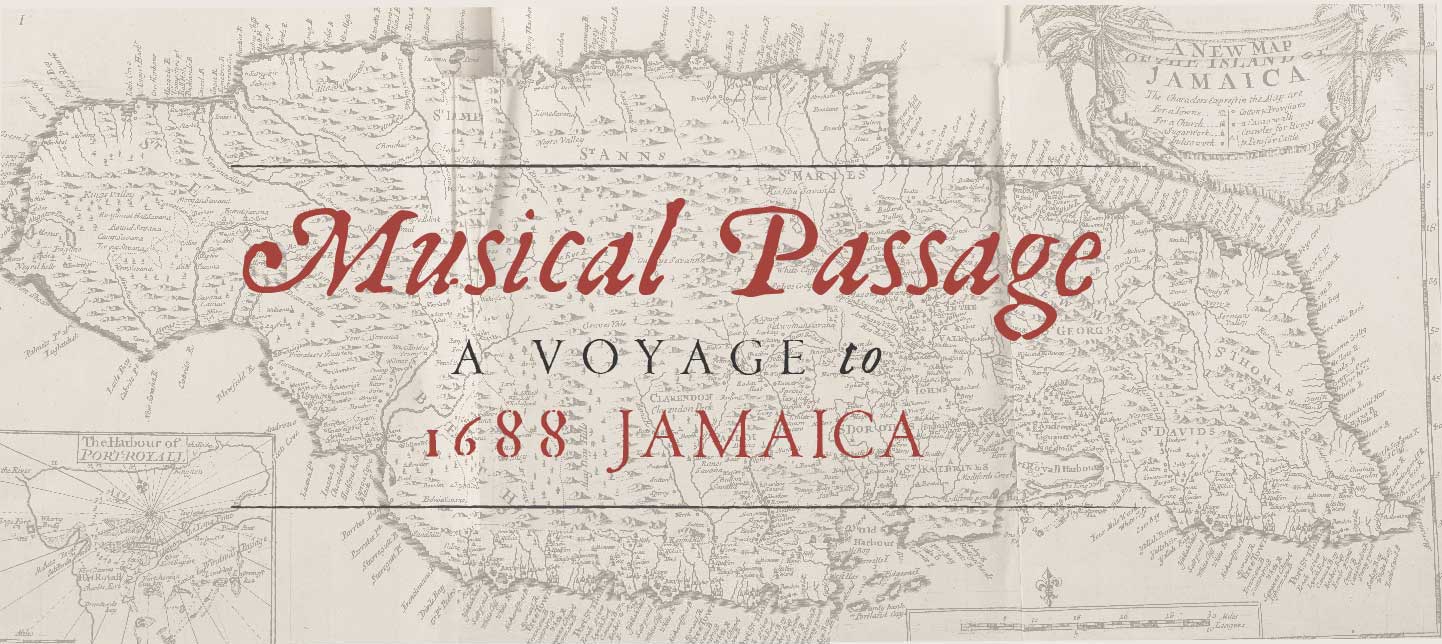
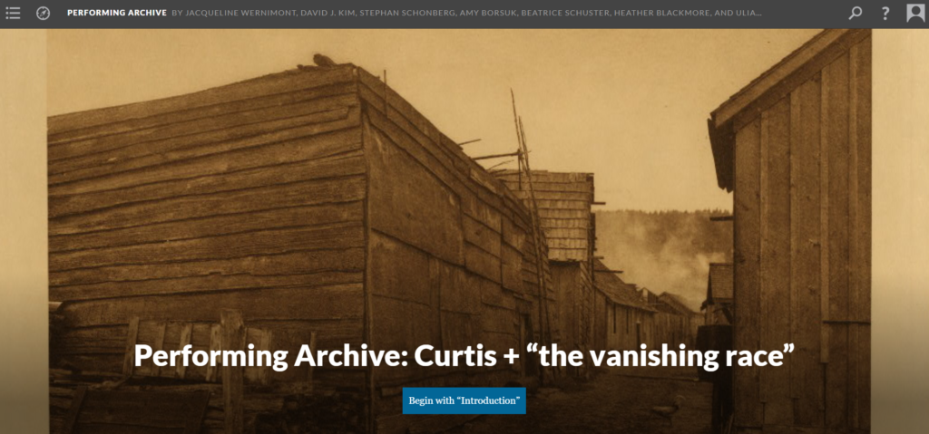
Performing Archive: Curtis + “the vanishing race”. https://scalar.usc.edu/works/performingarchive/index. Created and maintained by Claremont Center for Digital Humanities. https://scalar.usc.edu/works/performingarchive/acknowledgements. Reviewed February 2020.

The Performing Archive: Curtis + “the vanishing race” project emerged in 2018 with funding from the Andrew W. Mellon Foundation. This project serves as a digital archive for the photographic works of Edward S. Curtis, and as a virtual exhibit space for work that responds to Curtis’ exploitation of Native American tribes. This interpretive work questions concepts of permission and consent for the Native peoples in question and serves as a meta commentary on the digital humanities.

The site features over 2,500 digitized archival items from seven institutions. Users can search these items using keywords or use the site’s visualization tool to explore how items interconnect with one another. These tools are immediately accessible, but the site’s layout encourages users to read the “Introduction” page before embarking on their personalized journey. The “Introduction” page gives an overview of the project’s background and goals, then details how to use the site most effectively. While you can search at any time, there are “paths” that lead to different items and exhibits. The user is put on a pre-set path through a few exhibits, putting the most critical and contextual work first. By clicking on the links inside the exhibit texts, the user can deviate from the set path to explore new items and interpretive pieces. This method exploration allows the user to dive a bit deeper into the incredible volume of content available within this project.

This site’s content is extensive because the creators have allowed the public to contribute their research and interpretation of Curtis’ work using a review process to control what occupies their site. These interpretive pieces can be found using the visualization tool and the search bar, leading to topics from YouTube to Curtis’ conceptions of race. If a user isn’t quite ready to publish their own research, they can use the comments function to give feedback and input without investing as much time as engaging in original research. In these ways, the project welcomes all people to become a part of this project. The site also features resources for working with Native stakeholders, and plans to contact Native peoples for future work, emphasizing the need for their input and consent in projects dealing in Native history. By showing their practices clearly, the project welcomes Native users, reassuring them that while Curtis was exploitative, modern creators and historians can and should be better. This project certainly acheives these goals.

Performing Archive: Curtis + “the vanishing race” is completely transparent in their methodology, which preserves the trustworthy image of this initiative. The design and methods are incredibly strong, with the only drawback to the site being the visualization tool’s loading time, which at worst can take over a minute. The user can choose how they want to interact and contribute, which is a huge plus for engagement. This type of project has no equivalent in the physical world, making use of online tools for increased engagement and thoughtful interpretation. Performing Archive: Curtis + “the vanishing race” serves as proof of what Digital Humanities at its best is capable of.

Keep the Pulse. The One Orlando Collection Review

Keep the Pulse. The One Orland Collection http://oneorlandocollection.com/ The Orange County Regional History Center, February 17, 2020

Keep the Pulse is a digital gallery honoring the victims and survivors of the June 12, 2016 mass murder at Pulse Nightclub in Orlando, Florida. The home page provides us with an image of a vigil with brief text describing the digital library and asking the site’s visitors to #Rememberthe49. Its imagery and sparse description is impactful, setting the tone for the rest of the website. If you scroll down, more information is provided, including the victims and their names, and access to the digital library, which commemorates the lives of the victims, as well as the LGBTQIA+ community coming together to mourn and rise up. The rest of the homepage provides information on the conservation process and how one can connect on social media, volunteer, or donate. Keep the Pulse is a heartfelt tribute to the victims and survivors of June 12, 2016 that inspires visitors to reflect and support the community of Orlando.

The Homepage to “Keep the Pulse.” sets a somber and reflective tone.

When arriving to the homepage of Keep the Pulse and seeing the photo of the vigil, visitors to the site will notice the care and reverence taken to make the digital gallery a place for reflection and respect. The name of the gallery is located on the top left of the homepage in white serif font with the colors of the LGBTQIA+ flag running vertically to its left side. The title is modestly sized, giving up most of the screen to the photo of the vigil outside Pulse nightclub. In a transparent text box is the headline: #Rememberthe49. Below it is a brief description of the digital gallery and the curators. Giving the photograph of the vigil space provides visitors with a moment of reflection, as well as setting the tone for the rest of the site. On the top right of the screen is the menu bar. Right below it is the option to view the sight in Spanish. The Spanish option is an important act of inclusivity. Most of the victims of June 12 were Latinx, making the incident one that affected both the Latinx and LGBTQIA+ communities and all the intersectionalities in between. Scrolling down, the site provides access to the digital library and images of the 49 victims.

The ‘About Page’ on Keep the Pulse provides a brief description about the incident at Pulse Nightclub and shares photos of the 49 victims of that tragic night.

Scrolling down the page, the digital library provides images of the 49 victims. The highlighted image provides the name of the victim. It is here that I have my only critique of the website. I wish there were a brief bio about the victim or anecdotes written by found or biological families. I would also prefer that each image provide links to other artifacts in the digital library that are connected to the specific victim. There are several links that provide access to the digital gallery, where one can view all the artifacts or filter by category or by victim. I like the options for filtering, but people who aren’t part of the queer Orlando community may not know the victims personally. The filtering option only provides names. I would suggest providing images as well. Providing a face to the name when looking through the artifacts would humanize the experience further. After looking through the gallery, there are links that provide further information on the project, or next steps visitors would want to take.

Visitors to the Keep the Pulse digital gallery have the option to take further actions after reflecting on the events of June 12, 2016. For further information on the website’s construction, the Orange County Regional History Center provides a summation of how the gallery came to be. There isn’t a page about their ethical approach, which I feel is missing, but the site does contact information in case visitors have further questions. The digital gallery also invites people to share their reflections on social media with #Rememberthe49. The site provides suggestions, events, general information about nonprofits, and frequently asked questions. The people behind the site have considered various site visitors and provide information that will help people contribute as much, or as little, as they can.

Keep the Pulse has remained active and it appears it will continue to be active as we enter the fourth anniversary of the tragedy at Pulse Nightclub. This digital history is preserving the events of June 12th so that it won’t be soon forgotten. The site is easily navigable and provides a sense of reflection and reverence that the victims deserve. Visitors to the site can honor the victims by looking through the gallery, or taking further action, depending on their resources. The site stresses acts of love and kindness, and this digital gallery is emblematic of that notion.

Digital Review: Musical Passage

Courtesy of Musical Passage.Org

Musical Passage. http://musicalpassage.org/#. Created by Laurent Dubois, David Garner, and Mary Caton Lingold. http://musicalpassage.org/#about. Reviewed February 16, 2020.

The Musical Passage is a digital project that offers a musical transcription of early African diasporic music by enslaved Africans undertaken by slave ships to the West Indies during the Atlantic slave trade. The site also presents historical information relating to the Middle Passage as it simultaneously entwines the musical reference to the narrative. The project gives an interpretation of a rare artifact obtained by Hans Sloane’s 1707 Voyage to the Islands of Madera, Barbados, Nieves, S. Christophers, and Jamaica containing musical pieces during this historical period. The Musical Passage offers audio renditions aimed at reconstructing the sound, rhythm, and musical composition and arrangement to these early musical masterpieces. The focus resides in decoding and dissecting five musical pieces of which differ in musical style, arrangement, and tempo. Additionally, each piece of music whether instrumental or vocal gives a supplementary perception of the backstory of the songs and a conception of the instruments used at the time.

The home page of the site opens with a digital image along with metadata of Hans Sloane’s document which contains the earliest transcription of African Caribbean music as Sloane interpreted and invites the visitor to listen to the musical arrangements by clicking on the play icon. The music incorporates ambient sound of the ocean tide as the music plays giving the audience a feeling of Caribbean ambience. Users can navigate three options near the play icon which include tabs explore, read, and about. Clicking on the explore tab does not bring about additional information. As a matter of fact, nothing changes on the home page when clicking the exploration tab. Secondly, clicking the read tab will allow the user to navigate through a digital design similar to ArcGIS StoryMaps using HTML5, CSS, and libraries jQuery, Bootstrap, and FullPage.js.

The read option allows for three portions of extensive informative history concerning Han Sloane’s artifact, a book entitled Voyage to the Islands, the Middle Passage, and the history of five pieces of seventeenth century sheet music.The first portion describes how Sloane traveled to the Caribbean, specifically Jamaica, and observed the cultural practices of the enslaved African population in addition to his study of the island’s ecology. During Sloane’s time in Jamaica, he cataloged plants and animals on the island while collecting cultural artifacts and scientific specimen which can now be seen at the British Museum. The second portion is comprised of historical content of the Middle Passage and its effects on enslaved Africans. The passage depicts the cultural influence brought from their native Africa to include practices, rituals, customs, and music which influences present day vocal and instrumental sounds attached to the expression of emotion.

Finally, the third portion contextualizes the history, musical notation, engravings of some of the earliest depictions of instruments, and the song interpretation of each musical piece. The selection clarifies that the rendition of the music is by the project’s inference as it is difficult to know the precision of what the music originally sounded like. The passage invites their users to contribute their own musical interpretations for the purpose of inspiring future improvisations. Furthermore, towards the end of the narration, there is a solitary assessment of the five musical compositions illustrating differences in notation, melody, musical scale, vocal pattern, and lyric analysis. The metadata includes an image of Hans Sloane, natural history engravings of mollusk shells from his book, an engraving of three instruments he collected (no longer in existence), and five images of one bar of music for Angola, Papa, Koromanti 1, Koromanti 2, and Koromanti 3.

The about tab redirects the user to learn more about the project, its mission, project design details, musical responses to the project, collaborations, biographical information on the project’s creators, acknowledgments, a digital humanities bibliography, and further readings. The page is very detailed in its mission for the project in addition to the remaining about topics. Moreover, the project encourages its users to give feedback on their efforts or contribute further interpretations on the musical material. It cites forms of contact through twitter, their website, or through email. It also recommends that the user stream the recordings through Soundcloud. The musical response paragraph intrigued me the most as it provided additional metadata through the use of YouTube to show a video of a group of musicians invited by the Institute of Jamaica in Kingston to give a live improvisation of this music in front of an audience.

All things considered; the digital project Musical Passage is a great project! It was enjoyable learning about the inception of music and its origins considering the influences it provides to the evolution of music as it exists today. It rooted from unfortunate events by way of the Middle Passage and yet through so much pain and suffering, enslaved Africans were able to create and beautify the art of music as a form of storytelling. The diffusion of their African culture and traditions using music immortalized their place as trail blazers and pioneers of musical expression and demonstration. The project itself embellished this information providing both visual and audio support to transport the user to seventeenth century Jamaica. The goal in these digital projects are to inform and supply a deeper appreciation for the history produced by their work and this project did just that.

Digital Review: Bracero History Archive

Bracero History Archive. http://braceroarchive.org/. Created as Co-Principle Investigator by Sharon Leon and Tom Scheinfeldt. . http://braceroarchive.org/about. Reviewed January 26, 2020.

The Bracero History Archive is a digital collection of images, documents, oral histories, and artifacts collected to record primary sources, evidence, and data pertaining to the Bracero Program. The Bracero Program was a sequence of diplomatic legislation between U.S and Mexico, which was originally instituted by an American executive order in 1942, to abate the issue of labor shortages during World War II. The program’s labor contracts for Mexican immigrants seeking temporary work in the U.S., mostly related to U.S. agriculture. The program provided an opportunity for Mexican immigrants to seek a better life, yet over the course of the program’s existence, it was apparent that the United States government exploited their great opportunity by oppression and mistreatment. This digital archive provides a voice for those Bracero workers and their families.

This digital archive provides 3,209 total items, under the archive tab, which is divided by five sub-tabs that present an option of images, documents, oral histories, contributed items, or all items. Users can further navigate the site to explore teaching and historical information regarding the Bracero program. Additional options exist to allow the user to learn more about the digital archive and its mission. The site provides supplementary information regarding their site and virtual partners that contribute to this digital archive. The metadata includes texts of personal statements that contextualize the history behind the program and how it affected each individual and their families. The images tab provides digital metadata to include detailed descriptive images, scanned labor contracts, paycheck stubs, work permits, and items such as postcards.

In addition to each metadata, it provides bibliographic citations and a list of keywords related to the Bracero History Archive. The oral histories tab provides personal testimony by audio regarding Bracero workers and/or their families recalling stories of the program. In most of the audio recordings, the interview is conducted in Spanish. Although most items have thorough metadata, the audio recordings do not include description, text, creator, or a date for the interview. There is no option for translation, either through text or audio, for the interviews conducted in Spanish which might prove challenging for a non-Spanish speaking user of the site. The oral interviews that are conducted in English do give a date and time through audio but lack separate descriptive metadata. The interviews are at times difficult to hear due to background noise and separate conversations happening close to the interview.

This site is open access and does provide a URL for users to gain access to the archive’s metadata if they so wish to contribute to the archive. It produces resources and video tutorials giving step-by-step information on how to navigate Omeka providing information on how to effectively use and add to the digital archive. Additionally, it provides information on how to effectively scan and upload digital images, documents, and other relevant artifacts that contribute to the history of the Bracero program. The resources tab provides information on how to conduct an interview, what questions to ask, a checklist for your interview, and files and documents for authoritative release.

The Bracero History Archive was a 2010 winner at the National Council on Public History and awarded the Public History Project Award. The site has much potential and the idea structure behind the archive is worthwhile, yet, it seems not much has been updated since possibly 2010. Navigation is easy but rudimentary in terms of deficiency regarding metadata and historical information. The history tab only gives a giant bibliography and does not interpret or give much background information on its collection. The site should acknowledge more visibly that it is not actively curated or updated anymore.

All things considered, the Bracero History Archive is sitting on a gold mine with these great interviews, documents, images, and artifacts within its digital archive. There is a great need for labor in adding metadata to many of its items. It could also benefit from a digital make-over to be more aesthetically appealing. Maps and other visual aids would be more helpful in dispensing a geographical idea of designated areas in the country where bracero camps existed and parts of the country where the law was invoked for labor necessities.

An Unsinkable Demo: The Titanic Honor and Glory Team’s Masterpiece in the Making.

Titanic Honor and Glory https://www.titanichg.com/demo overseen by Vintage Digital Revival LLC https://www.titanichg.com/the-game January 19, 2020.

Titanic Honor and Glory is an in-development video game that seeks to take its players back in time to explore the most famous ship in the world. In the third and final demo, players play as a British Board of Trade inspector who arrives at Harland and Wolff Shipyard prior to Titanic’s sea trials and just days before the beginning of her fateful maiden voyage. The player has free roam of a small section of the Shipyard where they are free to explore the beautiful scenery of Northern Ireland, gaze at the stunning Titanic that looms majestically in the background, and even explore parts of the shipyard itself that is littered with evidence of Titanic’s impending voyage. As the Board of Trade inspector, the player can navigate through a literal maze of coal cars, paint-making shops, and privies in order to find the right way onto the gangway that leads to Titanic’s first-class entrance. However, it is onboard the Titanic where the demo shines most.

The player can wander through a small portion of the interior of Titanic which has been meticulously and beautifully recreated through in-depth research and a game development software. As the player moves from one exquisite room to the next he/she can read brief descriptions of each room and some of the decorations in them. They can admire the beautiful wrought iron glass domes of the Titanic’s grand staircases (Yes, there were two: One fore and one aft), walk through the first-class reception room (of which there were also two: one for the dining saloon and one for the restaurants), marvel at the French walnut paneling in the exclusive A La Carte Restaurant, and trek down Scotland Road to the sweltering Boiler Room No. 6 and the Utilitarian Third-Class dining saloon; all the while learning the purpose of each room and Titanic’s interior layout. This demo offers, without a doubt the most accurate and realistic depiction of Titanic ever made for any platform in history.

However, the demo has its limits. It is, after all, a demo and is not designed to offer the full game experience. In the full game players will be able to explore every inch of Titanic; from the grand dining saloons to the smallest closets. Also, the players will be able to play a story mode with a murder mystery story in the final product. The demo does suffer from cringe dialogue from its lead character. For example, at one point he proclaims himself as the most handsome man on Titanic! Additionally, there are some stiff looking seagulls that follow you around the shipyard. Nevertheless, this demo offers just a sliver of what the final product will be, but more importantly, it is a testament to the passion of the developers.

The audience for the Titanic Honor and Glory demo is diverse. Titanic is, after all, the most famous ship in the world, and anything to do with the vessel always garners significant attention. This demo is no exception. It certainly has plenty of content to offer causal fans of the movie or those who are familiar with Titanic’s story but want to know more. However, it is unique in that it aims to educate in a fun and interactive way by allowing players to explore the Titanic itself. Additionally, the demo offers something special for Titanic enthusiasts and historians. It is the most accurate depiction of Titanic ever made. The lack of photographs of Titanic’s interiors has made it difficult to determine how Titanic really looked, especially when compared to Titanic’s older sister Olympic with whom she shared many similarities and differences, but thanks to the remarkable research and sheer dedication of the Titanic Honor and Glory team historians and enthusiast will have a truly unique tool that will help answer some of these questions in the most detailed and accurate way possible.

The Titanic Honor and Glory team have used the Unreal Engine Four to bring Titanic back to life for their game. Unreal Engine Four is one of the best game development softwares out there designed to offer a truly immersive and life-like experience for gamers. As one walks the halls of Titanic in this demo you realize that she lives again in this game; As real to you, as she was to those who sailed in her 108 years ago. What this demo has accomplished and what the Titanic Honor and Glory Team are still working to accomplish is truly special. There have been a lot of Titanic games, but never one that is so dedicated to accuracy and indeed to history as Titanic Honor and Glory.

One of the most important components of DH is the corroboration between members of a project team and their community. The Titanic Honor and Glory has worked for years to foster a large and devoted community. Their online presence is impressive with their youtube channel having over 200,000 subscribers and some of their videos having over one million views. More importantly, the Titanic Honor and Glory team has consulted with leading Titanic historians like Ken Marschall and others as well as descendants of survivors to create as respectful and authentic a Titanic experience as possible. Their development team is diverse as well, drawing from all parts of the United States and some of their consultants are also from the U.K. and Europe.

Titanic Honor and Glory is a masterpiece in the making. Their team’s dedication to historical accuracy and detail in their game will make this game an unforgettable experience.

An image depicting a parlor suite on board Titanic with its ornately carved wood work and period appropriate furniture with fireplace and mantle
A rendition of Titanic’s Empire Style Suite rendered by the Titanic Honor and Glory team and released March 14, 2018 | Courtesy of Wikipedia Commons

Digital Review: Wearing Gay History

Wearing Gay History. http://wearinggayhistory.com/. Created and maintained by Eric Gonzaba and Amanda Regan, http://wearinggayhistory.com/about. Reviewed Jan. 2020.

The Wearing Gay History project is self-described as “A Digital Archive of Historical LGBT T-Shirts,” hosting the queer t-shirt collections of 14 different American archives. The digital archive contains shirts from the last 40 years of queer history, and showcases them using Omeka, a platform friendly to digital archiving. The website puts LGBT history in context with itself, defeating coastal biases and exhibiting the diversity of the queer community.

The site features over 4000 items that have been divided into 21 collections based on their origin. Users can search the items by a list of preset tags, by collection, or by detailed search using keywords, locations, and other signifiers. The images are not uniform in background color or mannequin, but these details don’t detract from the cohesiveness of the archive. The metadata includes a description of the creator, date, place of origin, subject, and a few other fields. Each item includes a citation and information about copyright, which is a great help for those wanting to refer to these t-shirts in their work.

The site also includes interpretation of its collections in the form of digital exhibits. These exhibits use the digitized t-shirts to inform about queer history by placing these shirts in context. Many of these shirts require context that non-experts don’t understand without explanation. The page “The Ones that Laughed: Humor in the LGBT Community” explains the necessary context of humorous t-shirts. For example, a t-shirt reading “Homo-Depot” is a play on a scandal involving the department store Home-Depot. The site uses this t-shirt to inform its audience about the history of anti-LGBT workplace policies during the 21st century .

The goals listed on the “About” tab are congruent with the digital products featured on the site. To counter bicoastal  bias, the site includes a t-shirt map  that shows that the bulk of the digital archive comes from inland. To examine the connection between distinct identities is the site uses a tag system, many items having multiple tags which span across differing identities. The goal of increasing visibility for small archives is met by the map as well, shirts grouped according to their archive of origin. Making these collections accessible to the public, this site brings queer history to the forefront  of public consciousness. The site shows commitment to education by linking to other digital resources about the queer community, including articles and other digital archives.

While the site does well to reach the goals its set out, navigation and inclusivity serve as minor issues. While the tag system is helpful, the map is accessible, and there is a means of searching the shirts, the search feature is a bit intimidating, containing many fields that have little use for the non-expert. Additionally, this archive isn’t inclusive of many queer identities that have developed more recently. While the archive includes many examples of Lesbian, Gay, Bisexual, and Transgender t-shirts, it excludes (though not intentionally) the other identities that the expanded LGBTQIA+ features. Because, these identities are only beginning to gain visibility, it’s understandable that this archive of the past 40 years of queer history would face difficulty keeping finding materials representing all identities.

In all, this digital archive achieves its many goals through its diversity of materials, interpretation, and ease of use. This archive has clearly been curated by queer historians with a queer audience in mind. It uplifts the queer community, and makes often forgotten tales available at your fingertips.

Sherman’s March and America: Mapping Memory – A Digital Review

Sherman’s March and America: Mapping Memory. http://shermansmarch.org/. Directed by Anne Sarah Rubin (Professor of History, UMBC). Received production assistance from the American Council of Learned Societies’ Digital Innovation Grant Program, the University of Maryland, Baltimore County, and the Dresher Center for the Humanities. http://shermansmarch.org/about/credits/. Reviewed on April 18, 2019.

As the title suggests, this site maps out General Sherman’s infamous march across Georgia near the end of the American Civil War. Starting off, the homepage is a single image of the title and map. Title aside, the homepage has very little to offer in hooking the audience. The map section features five different types of perspectives: Sherman, civilians, tourism, soldiers, and fictional (which consists of historical songs). Each type has a different map aesthetic but all feature pins that point to interesting events. Clicking on a pin opens a brief description of events that occurred at that location, usually accompanied by an image. Some of these pins only have an audio clip, although it takes a few seconds to open, and there is no way to pause or move the clip forward or backwards. Unfortunately, the map is a work in progress. Many of these pins are blank, especially the “tourism”, “soldiers”, and “fictional” maps. I believe that more images and more primary sources could benefit this site, as only a small number of images are displayed. There should also be some indication as to whether the pin is a text entry, video or an audio file. The site has a small bug in which clicking and exiting out of the Covington pin on the “civilians” map causes it to freeze. On a smaller note, each popup could have an exit button to make it easier to close, as some people may click the back button on their web browser which takes them back to the homepage.

Aside from the map, the site has a blog that gives first-hand accounts of Sherman’s march. These include memoirs of Sherman and diaries of soldiers and civilians. While this is a nice addition, I wish there was more background context to these posts. It would also be nice to have the primary source attached to each blog post.

The site is said to be completed by November 15, although no year is given. It is unclear as to when this site was last updated, but it seems recently because of the copyright. This site is aimed towards a large public audience, as the author points out that they do not wish to fill the viewers with text-heavy documents. While more work needs to be done, like a more engaging homepage or more pin entries, the site is making progress, and has the potential to attract a wider audience.

Digital Review 3: The Well Read President: Examining the Reading Habits of Theodore Roosevelt

After looking through the American Historical Associations website I noticed an interesting excerpt. The American Historical Association conducted a conference in the beginning of 2018 that included a section called, “Digital Projects Lightning Round.” There were about 15 separate digital history projects that reigned from Omeka sites to text mining. Of these separate sites, the one that intrigued me the most is, “The Well Read President: Examining the Reading Habits of Theodore Roosevelt,” by Ms. Karen Sieber at Loyola University in Chicago, IL.

Her Project begins with a Word Press site that explains how she came to wonder and in turn research this topic. She understood that Theodore Roosevelt throughout his life is an avid reader and an author himself to many manuscripts. Sieber saw the opportunity for a truly interesting text mining project that can show influence through Theodore Roosevelt’s political career. She creates a visual timeline of teach book that Roosevelt is believed to have read during 1901-1904, his first term as president. The timeline also includes a virtual bookshelf that holds a selection of these books through themes. Sieber’s main purpose and thesis of the digital project is to show Roosevelt’s connection to the books that he read and how they shape his diplomatic decisions as well as his family relationships.

Once entering the timeline, the user is presented with a quote by Theodore Roosevelt himself that explains his love for books and how they connect with the idea of choice. The quote is presented with an image of Roosevelt sitting in his own personal library at home. The user is then asked to click onto the next slide that explains everything that is written in paragraph two while also including that each book in the virtual bookshelf can be read for free with a link through the book title. The slide show continues and begins with the first book on October 12th, 1901 being, “Uncle Remus.” An image of an illustration within the book is placed next to a short paragraph that explains President Theodore Roosevelts connection to the book being a duty as a father. This slide show goes on and proceeds in this arrangement through the timeline of his first term. Looking at the timeline, which is placed above the slide show, the user can interact with it. The user is allowed to skip around the timeline and choose which book they would like to learn more about and the books relationship to the former president. On the left-hand side of the timeline, each book is placed in a group of themes. These themes include, Father, President, Intellectual, Historian, and Outdoorsman.

Some points that do need to be addressed are the user interaction with the themes and the number of books on the timeline. The timeline could be improved by allowing the user to choose one of the assortments of themes to look at only a certain range of books. This is an organizational suggestion that could make it easier for the user to understand the concept. The other quick concern is that there is no scroll bar to move through the timeline making it harder to see the full scope of it. There are a good number of books on the timeline, but it does seem contradicting when the introduction explains that Theodore Roosevelt would at many times read a book a day. This timeline only places a handful of books a month, this may just be due to lack of resources. One may not be able to know each, and every book read by Theodore Roosevelt during this time. Overall this digital project is very exciting, and I believe is the best way to show this type of research. This research is made to best be done as a digital project. https://cdn.knightlab.com/libs/timeline3/latest/embed/index.html?source=1XxQsrOujJ-jtnzdjaF15oXhvXN4pJUurFnxf8_Xsc6w&font=Default&lang=en&timenav_position=top&initial_zoom=2&height=650

Review of Remembering Rondo

Remembering Rondohttp://rememberingrondo.org/. Created by partners Rondo Avenue Inc. and Dr. Rebecca Wingo with students of an archive class at Macalester College, in St. Paul, Minnesota. http://rememberingrondo.org/historic-rondo-businesses/. Reviewed February 21, 2019 – February 22, 2019. 

Dr. Rebecca Wingo taught an archives class that partnered with Rondo Avenue Inc. to create a map of the businesses in the historic Rondo neighborhood.  The students mined and scanned business ads from historic newspapers from this community, and selected ESRI StoryMaps Tour and Journal to organize the files and create the map. 

Remembering Rondo begins on the home page by clicking on the first link that appears when one searches. The page has “Places & Spaces”, “Life & Culture”, “Voices” and “Buy now!” Underneath these tabs are four other tabs — Map of Historic Rondo Businesses, Photo Archive, History Harvest and Team. Scrolling down further, there is a section that says, What’s New, Entertainment and News and Politics, presenting recently added to the site allowing one to scroll through the newest additions. There are filters that can be applied to manage what is seen by clicking all or three horizontal dots that provide a more detailed search. Next, it breaks down to another section that is formatted differently, with three tabs (Popular, Recent and Comments) showing articles life above.  Then there is the “Featured Posts” section and ”Recent Stories” section.  There is “Follow Us” and a subscribing section. Finally, there are “Most Viewed” and “New Restaurants in the City” sections.  Towards the bottom, there are “Most Viewed”, “Most Popular”, “News Tags”, and “Categories.”

The information on the site is well communicated and written.  The content that is written about is not difficult or too challenging to read. The intended audience, which is the local Rondo and St. Paul community seems to be very clear due to the creators and partnership of the project and the background of how the project was created. The images provided in the photo archive are of high quality but do not contain much metadata, however this may be due to the fact that it is from a private collection.  The history harvest (when community members are invited to share their letters, photographs, objects, and stories and participate in conversations about these items) Omeka website, which is embedded into the site, provides basic and sufficient metadata about the items brought in from the history harvest. The Omeka website is well-organized and provides different options to browse and search.

The actual site is set up very nicely and has a professional and modern aesthetic, and choices of the colors. The site is fairly easy to navigate, though it may be confusing for one that is not familiar with technology.  The home site provides a lot of information all at once and not a lot of context until one looks through the other tabs of information. I wonder if all of this contextual information could be put in one place to make it easier for the audience or guest viewers. The site is very compatible with tablets  and mobile-friendly. I tried on my iPhone and it did not require manipulation such as, zooming in or out. The site contains some quirks, such as the “Team” tab on the top of the site not working and what appears to be a photo and perhaps something connected with a Twitter page related to the digital project.

Since the team page is currently unavailable  for use, I am unable to make all the correct attributions except for the community partner, Rondo Avenue Inc., Dr. Rebecca Wingo and the archives class.

Overall, this digital project contributes to the field of digital history, providing examples of successful collaboration between a community and institution.  With minor fixes on the different links and perhaps taken from the suggestions previously made, this website can blossom even more so. The unique layout and design draws attention to the different articles and pieces of history presented in a different form, that most do not think of history as, when one thinks of history only in the traditional sense.

S. Shine Trabucco

St. Mary’s University 

San Antonio, Texas

Railroads and the Making of Modern America: A Digital Review

Railroads and the Making of Modern America. http://railroads.unl.edu/. Directed and edited by William G. Thomas, III (Professor in Humanities at the University of Nebraska–Lincoln), Richard Healey (Professor of Geography at the University of Portsmouth U.K.), and Ian Cottingham (Software Engineer for the Computing Innovation Group at UNL). Received production assistance from the University of Nebraska-Lincoln. http://railroads.unl.edu/about/team.php. Reviewed February 22, 2019.

Railroads and the Making of Modern America is a digital project that looks at the social impacts of railroads in 19th-century America. It covers topics such as slavery, the Civil War, politics, migration, segregation, tourism and railroad work. The website implements visual aids including documents, maps, and statistical graphs.

As an example, when you look at Slavery and Southern Railroads under the topics tab, there are two columns: On the left are documents and on the right are visual aids. Under documents, you can take a closer look at contracts, annual reports of railroad companies, and letters. When you click on contracts, there are seven items – all of them are receipts for a slave purchase. One receipt was for the sale of slaves to the Mississippi Central Railroad Company on March 5, 1860. It briefly describes and shows a photo of the receipt. Underneath it is the metadata in the “about” section. It gives the source, the citation, the date, and other related topics. In the letters, they all have a description, but some do not have the photograph of the letter. However, these contain a transcript of the letter. As for the visual aids, many are maps to visualize information. Some require Adobe Flash Player 8 to view.

The next tab on the website is “views”, which are specific cases that focus on a research question or problem. Some of these “views” include passenger mobility in the 1850s, land sales in Nebraska, the growth of slavery and Southern railroad development, and women’s experience on the Great Plains in the 1850s. Just like the topic section, these “views” use multimedia when presenting the material.

This project openly shares their data and tools used in the making of this site. Under the data tab, you can download these resources for free. The authors encourage you to use these resources for your own research. The search bar for this project has several categories to limit your searches. These include types of document, the topic, scope, year, and publication.

Railroads and the Making of Modern America features four railroad-related projects from several graduate students in history from the University of Nebraska-Lincoln. Finally, this site offers teaching materials such as seminars, interviews, worksheets, and links to other teaching sites for university, college, secondary and elementary school teachers. Just like the sources provided in the data tab, these resources are free and open-source.

Funded by the National Endowment for the Humanities, American Council for Learned Societies, Economic and Social Research Council, and the UNL Office of Research, this digital project uses digital tools and primary evidence to analyze social changes and impacts that relate to the development of the railroad. There is plenty of data here already, but this is a work in progress. The project team is currently working on adding documents and visual materials to the website to further help teach American history. This project is most suitable to those who want to research this topic or teach it in an academic field.

css.php